Box Plot
A box and whisker plot—also called a box plot—displays the five-number summary of a set of data. The five-number summary is the minimum, first quartile, median, third quartile, and maximum
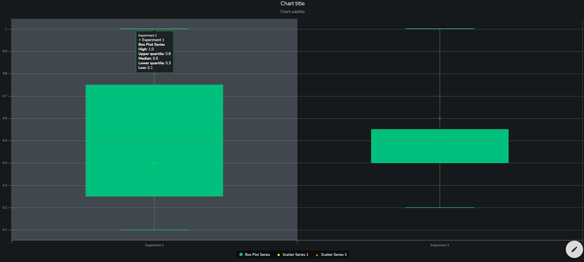
Data
Data Source
The Data property of the BoxPlot expects an SDD and the describing keys defined
Category Key
Mandatory key that holds the cateogry value.
Low Key
Mandatory key that holds the low (lower range of the stem) value.
Q1 Key
Mandatory key that holds the q1 (the lowest point of the box) value.
Median Key
Mandatory key that holds the median (median line within the box) value.
Q3 Key
Mandatory key that holds the q3 (uppermost point of the box) value.
High Key
Mandatory key that holds the high (upper range of the stem) value.
Series Name
Optional name of the box plot series.
Fill Color Key
Optional fill color key, which will be used to determine the color the inside of the box.
Outline Color Key
Optional fill color in the data that determines the outline color of the box plot'
An example JSON can be found below:
{
  "sddFormat": "sdd/table/array-of-objects",
  "version": "1.0.0",
  "definitions": {
    "category": {
      "kind": "string",
      "optional": true
    },
    "low": {
      "kind": "number",
      "optional": true
    },
    "q1": {
      "kind": "number",
      "optional": true
    },
    "median": {
      "kind": "number",
      "optional": true
    },
    "q3": {
      "kind": "number",
      "optional": true
    },
    "high": {
      "kind": "number",
      "optional": true
    },
    "value": {
      "kind": "number",
      "optional": true
    },
    "value1": {
      "kind": "number",
      "optional": true
    }
  },
  "data": [
    {
      "category": "Experiment 1",
      "low": 0.1,
      "q1": 0.25,
      "median": 0.5,
      "q3": 0.75,
      "high": 1,
      "value": 0.4,
      "value1": 0.8
    },
    {
      "category": "Experiment 2",
      "low": 0.2,
      "q1": 0.4,
      "median": 0.5,
      "q3": 0.55,
      "high": 1,
      "value": 0.6,
      "value1": 0.7
    }
  ]
}
Properties
Color
Default fill color of the box plot series.
Scatter Overlay
Optionally the user can add scatter plot series that will show up on the chart alongside the box plot series.
Series
Value Key
Mandatory key that holds the value of the scatter series.
Name
Optional name of the series.
Color
Optional color of the series.
Color Override Key
Optional key in the data that determines the color override of the scatter overlay point.
Marker Enabled
Switch enabling the marker of the scatter plot.
Marker Symbol
Symbol of the scatter series. The following options are available
CircleDiamondSquareTriangleTriangle Down
Marker Size
Symbol of the scatter series. The following options are available
Extra SmallSmallMediumLargeExtra Large
Tooltips Enabled
Should scatter series tooltips be enabled.
Show default tooltip
Enable or disable the default tooltip entry showing the scatter overlay value
Tooltip Label
Optional scatter overlay tooltip y value label
Tooltip config
Format for a simple tooltip. Specify a suffix or prefix and set the decimal places.
Tooltip Column Config
Custom column tooltip config
Construct a custom tooltip by combining data from columns in the source data.
Column
Column from the data source to display in the tooltip.
Label
Alias to display instead of the column name.
Apply to all series
Should this column tooltip be displayed for all series?
Applies To Series
Which series should this tooltip schema apply to.
Prefix
Tooltip prefix.
Suffix
Tooltip suffix.
Is Numeric
Is the tooltip numeric? If yes, hide the properties related to numeric tooltips.
Multiplier
Converts the value to the chosen multiplier. For example, the option "Thousands" would convert the value "1000" to "1k".
Decimal Points
Decimal points to add to the number.
Capitalized multiplier
Capitalizes the multiplier value.
Locale used
Should the tooltip be formatted based on user locale?
Titles
Chart Title
(optional)
The title text to be displayed above the chart.
Chart Title Alignment
(optional)
How the title should be aligned. Supported values:
LeftCenterRight
Chart Subtitle Text
(optional)
The subtitle text to be displayed above the chart.
Chart Subtitle Alignment
(Optional)
How the title should be aligned. Supported values:
LeftCenterRight
Tooltips
Enabled
Enable or disable tooltips for all data points
Show default tooltip for 'Y value'
Enable the default value tooltip.
'Y value' tooltip config
Format for the chart values.
{
  "prefix": "",
  "suffix": "",
  "multiplier": "auto",
  "decimalPlaces": 1,
  "capitalize": true,
  "useLocale": true
}
Column Config
Construct a custom tooltip by combining data from columns in the source data.
Column
Column from the data source to display in the tooltip.
Label
Alias to display instead of the column name.
Apply to all series
Should this column tooltip be displayed for all series?
Applies To Series
Which series should this tooltip schema apply to.
Prefix
Tooltip prefix.
Suffix
Tooltip suffix.
Is Numeric
Is the tooltip numeric? If yes, hide the properties related to numeric tooltips.
Multiplier
Converts the value to the chosen multiplier. For example, the option "Thousands" would convert the value "1000" to "1k".
Decimal Points
Decimal points to add to the number.
Capitalized multiplier
Capitalizes the multiplier value.
Locale used
Should the tooltip be formatted based on user locale?
Legend
Enabled
A flag specifying whether the legend should be displayed in the chart.
Orientation
(optional)
Defines the way in which legend items are laid out within the available space. Available options:
horizontalvertical
Defaults to horizontal
Horizontal legend position
(optional)
Defines where the legend sits along the horizontal plane. Available options:
LeftCenterRight
Defaults to center
Vertical legend position
(optional)
Defines where the legend sits along the vertical plane. Available options:
topmiddlebottom
Defaults to bottom
Categorical / Value Axis
Enabled
Should the axis values be shown or not.
Title
(optional)
Title to display on the axis.
Font Size
Font size of the axis values.
SmallMediumLarge
Tick Labels Visible
Should the labels on the ticke be visible.
Range
Manually filter Value Axis values to be displayed. Value Axis values are mapped to integers. As an example, use [0,3] to display the first four Value Axis values.
In the case where the creator wishes to specify only an upper or lower range on an axis, the string auto may be
supplied for the bound whose value is inconsequential. For instance, an upper bound of 100 on an axis may be specified
like so:
[
  "auto",
  100
]
Grid Lines Enabled
Toggle gridlines for the axis on or off`
Plot Lines
Display a line perpendicular to the axis. Multiple lines can be displayed. As an example:
[
  {
    "value": 1,
    "width": 3,
    "color": "green",
    "dashStyle": "solid",
    "label": "Limit"
  }
]
Axis On Opposite Side
Display the axis on the opposite side of the chart.
Reverse
Reverse axis values.
Tick Rotation Limit
Limit the rotation of axis ticks (in degrees).
Animation
Enabled
Should highcharts animation be enabled or not.
Duration
Duration of chart animations (400 milliseconds by default).
Caption
Text
Specify text to display as a caption below the chart.
Alignment
Caption alignment
leftcenterright
Watermark
Enabled
Toggle the watermark on or off. The watermark shows the date and name of a logged-in user.
Text
Extra text to display in the watermark,