Pie Chart
A Pie Chart is a type of graph in which a circle is divided into sectors that each represent a proportion of the whole.
Properties
Data
Data Source
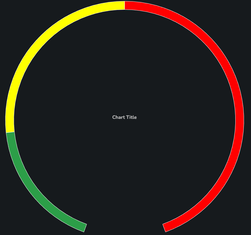
Array of objects applied to the chart. Value field is mandatory and is rendered on the chart evenly based on their sum. Optionally the user can add name and color properties. If no colors are supplied, default (varied) ones are applied.
As an example, the following snippet:
[
  {
    "y": 2,
    "name": "Label 1",
    "color": "#32A852"
  },
  {
    "y": 3,
    "name": "Label 2",
    "color": "yellow"
  },
  {
    "y": 5,
    "name": "Label 3",
    "color": "rgb(255, 0, 0)"
  }
]
Produces the following chart:
Value Key
The column in the SDD table that determines the size of the pie segments.
Name Key
The column in the SDD table that determines the series label of each pie segment.
Color Key
The column in the SDD table that determines the color of each pie segment.
Display Options
Start Angle
The angle at which the Pie Chart should start. The value -180 is at the bottom. The default value is -160.
End Angle
The angle at which the Pie Chart should end. The value 180 is at the bottom. The default value is 160.
Thickness
The thickness of the Pie Chart "donut". Supported values are:
Thin(default)MediumThickFilled
Titles
Chart Title (optional)
The title text to be displayed above the chart.
Chart Title Alignment (optional)
How the title should be aligned. Supported values:
LeftCenterRight
Chart Title Vertical Alignment
The vertical alignment of the chart title. Supported values are:
TopMiddle(default)Bottom
Chart Subtitle Text (optional)
The subtitle text to be displayed above the chart.
Chart Subtitle Alignment (optional)
How the title should be aligned. Supported values:
LeftCenterRight
Tooltips
Enabled
Enable or disable tooltips for all data points.
Show Default Tooltip
Enable or disable the default tooltip entry.
Tooltip Config
Format for a simple tooltip. Specify a suffix or prefix and set the decimal places.
{
  "prefix": "",
  "suffix": "",
  "multiplier": "auto",
  "decimalPlaces": 1,
  "capitalize": true,
  "useLocale": true
}
Column Config
Construct a custom tooltip by combining data from columns in the source data.
- Column - Column from the data source to display in the tooltip.
- Label - Alias to display instead of the column name.
- Apply To All Series - Whether the tooltip configuration should be applied to all series.
- Applies To Series - Which series the tooltip configuration should be applied to.
- Prefix - Tooltip prefix.
- Suffix - Tooltip suffix.
- Is Numeric - Whether the tooltip is numeric.
- Multiplier - Converts the value to the chosen multiplier. For example, the option
Thousandswould convert the value1000to1k. Supported values are:Auto(default)Raw valuePercentageMillionsBillionsThousands
- Decimal Points - Decimal points to add to the number.
- Decimal Points Mode - Whether to always show decimal points (e.g., display
2.00when a value set to2). - Capitalized Multiplier - Capitalizes the multiplier value.
- Locale Used - If specified will format the data label based on user locale.
Data Labels
Enabled
Whether data labels should be shown for the chart series.
Overlap Enabled
Allow data labels to overlap if there is insufficient space.
Font Size
Data label font size.
SmallMediumLarge
Column Config
Construct a custom data label by combining data from columns in the source data.
- Column - Column from the data source to display in the data labels.
- Label - Alias to display instead of the column name.
- Apply To All Series - Whether the data label configuration should be applied to all series.
- Applies To Series - Which series the data label configuration should be applied to.
- Prefix - Data label prefix.
- Suffix - Data label suffix.
- Is Numeric - Whether the data label is numeric.
- Multiplier - Converts the value to the chosen multiplier. For example, the option
Thousandswould convert the value1000to1k. Supported values are:Auto(default)Raw valuePercentageMillionsBillionsThousands
- Decimal Points - Decimal points to add to the number.
- Capitalized Multiplier - Capitalizes the multiplier value.
- Locale Used - If specified will format the data label based on user locale.
Legend
Enabled
A flag specifying whether the legend should be displayed in the chart.
Orientation (optional)
Defines the way in which legend items are laid out within the available space. Available options:
Horizontal(default)Vertical
Horizontal Legend Position (optional)
Defines where the legend sits along the horizontal plane. Available options:
LeftCenter(default)Right
Vertical Legend Position (optional)
Defines where the legend sits along the vertical plane. Available options:
TopMiddleBottom(default)
Properties
Min Height
Used to adjust height to fill entire space e.g. in container. Height units are in "rem".