Variwide Chart
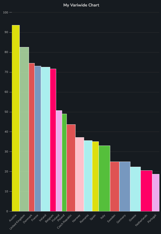
A Variwide chart is a categorical BarChart in which both the width and height of the bars is controlled by data.
Properties
Data
The Variwide chart expects data to be expressed as a JSON list that describes the chart in terms of columns that have been divided into sub-areas. The following typescript interfaces describe the JSON data (example below):
// describes an area within a column
interface IVariwideArea {
  color: string

  height: number

  name: string
}

// describes a single column in the chart
interface IVariwideDatum {
  category: string

  width: number

  // array of areas of variable height
  areas: IVariwideArea[]
}
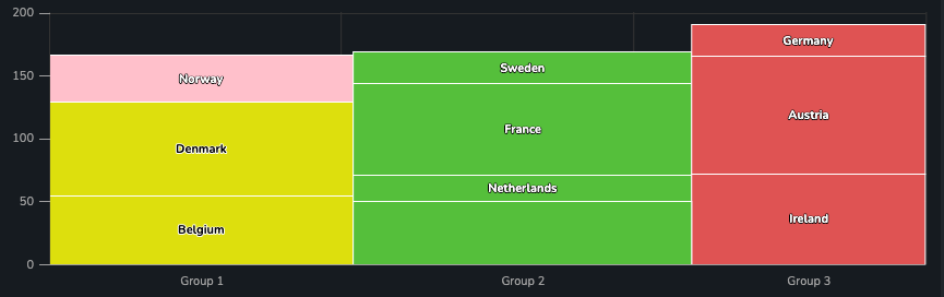
For example, by providing the following data:
[
  {
    "category": "Group 1",
    "areas": [
      {
        "height": 37.146621335796695,
        "color": "pink",
        "name": "Norway"
      },
      {
        "name": "Denmark",
        "height": 74.52590335723387
      },
      {
        "name": "Belgium",
        "height": 54.9340894325059
      }
    ],
    "width": 366.2343269046423
  },
  {
    "category": "Group 2",
    "width": 407.8577973507038,
    "areas": [
      {
        "name": "Sweden",
        "height": 25.01871722030527
      },
      {
        "name": "France",
        "height": 73.02640112290784
      },
      {
        "name": "Netherlands",
        "height": 20.590960325999312
      },
      {
        "category": "Finland",
        "height": 50.755697712148226
      }
    ]
  },
  {
    "category": "Group 3",
    "width": 281.49184543081384,
    "areas": [
      {
        "name": "Germany",
        "height": 24.99345424457907
      },
      {
        "name": "Austria",
        "height": 93.58339812545968
      },
      {
        "name": "Ireland",
        "height": 72.51773266576215
      }
    ]
  }
]
The following chart is produced:
Title
(optional)
The title text to be displayed above the chart.
Title Align
(Optional)
How the title should be aligned. Supported values:
leftcenterright
X Tick Rotation
Specifies the angle at which ticks on the x-axis should be positioned. Acceptable values:
0deg45deg90deg
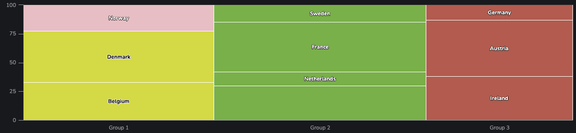
Marimekko Behavior
Emulates the behavior of a Marimekko chart:
- Columns keep the variable width received via configuration in Data
- Every column's height expands such that all columns are the same height (effectively scaling the height of areas within columns such that their height is a proportion of the column rather than true height)
For instance, consider the chart constructed in the example in Data. When enabling Marimekko Behavior the chart appears like so:
(X / Y) Axis Title
(optional)
Text to be displayed on either axis. Also controls the label that is displayed in the tooltip for the given axis (see the example in (X / Y) Units).
Enable Tooltip
(optional)
A flag that indicates whether a tooltip should appear when hovering over series on the chart.
Defaults to true
(X / Y) Units
An object in which prefix and suffix can be specified for values in the width (X) or height (Y) series, when displayed in tooltips.
As an example, suppose we have a chart in which X Axis Title is Expense and Y Axis Title is Orders. For our X Units, we provide the following JSON:
{
  "prefix": "$",
  "suffix": " per kg"
}
And for our Y Units, we provide:
{
  "suffix": " million/day"
}
The result is the following chart:
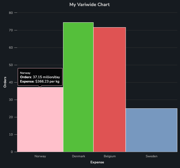
Note that it is strongly recommended to provide values for X Axis Title and Y Axis Title when tooltips are enabled, because otherwise the width and height series will be named Series 1 and Series 2 respectively.
Show (X / Y) Axis
(optional)
Show X Axis and Show Y Axis are flags which control the visibility of the axes.
Defaults to true for both axes (i.e. visible)
(X / Y) Grid Lines
(Optional)
Flags that specify whether the faint gridlines distributed evenly behind the series are visible.
Y Axis Range
(optional)
A tuple of length two that defines the range of the axis. For example, the following configuration will constrain an axis' values between 0 and 100:
[0, 100]
In the case where the creator wishes to specify only an upper or lower range on an axis, the string auto may be supplied for the bound whose value is inconsequential. For instance, an upper bound of 100 on an axis may be specified like so:
["auto", 100]
Adaptors
Table to Variwide Chart
The purpose of the Table to Variwide Chart is to construct a Variwide chart dynamically from an SDD data source. In this section, we will outline the properties of the adaptor, and provide example configuration to produce the following chart:
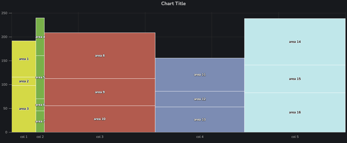
Table Data
This property should be linked to an SDD data source which will be used to generate the bars. Appendix 1: Variwide Data Set describes the dataset in detail.
The data must, at a minimum, include:
- Column to determine the
heightof the areas (Height Key) - Column to specify which
categorythe area belongs to (multiple areas allocated to the same category result in stacking) (Category Key) - Column to determine the
widthof each area. Note that all areas in the same category must have the same width (Width Key)
Optionally, the data may include:
- Column to be used as the
nameof the area (appears as text laid over the area) (Name Key) - Column to be used to color the area (
Color Key). The values could be numeric and used with a color scale, or strings and used with a color mapping. An example of both will be provided later in this section.
In the above example, the following configuration has been provided:
Table Datais linked to the data described in Appendix 1: Variwide Data SetWidth Keyis linked towidthValueHeight Keyis linked toHeight ValueCategory Keyis linked tocategoryName Keyis linked toareaName
Filters
The applicable/available filters in this adaptor are more similar to those found elsewhere in Dais:
Available Filtersmay be linked to an object that maps filter names to filter specification objects. These objects containkey, avalueand a filtermethod.Applicable Filtersare a list of filter names in the object supplied toAvailable Filtersto apply.
The supported values that can be provided to method are:
"equal""contains""between""lt""gt""lte""gte"
An example configuration could be:
{
  "ApplicableFilters": ["MyFilter", "MyOtherFilter"],
  "AvailableFilters": {
    "MyFilter": {
      "key": "y",
      "value": 50,
      "method": "gte"
    },
    "MyOtherFilter": {
      "key": "value",
      "value": [90, 180],
      "method": "between"
    }
  }
}
Color Key / Color Configuration
Color Scale
When Color Key refers to a numeric column in the data, Color Configuration must define a color scale. In this section, we will be producing a chart where the areas are colored using a color scale:
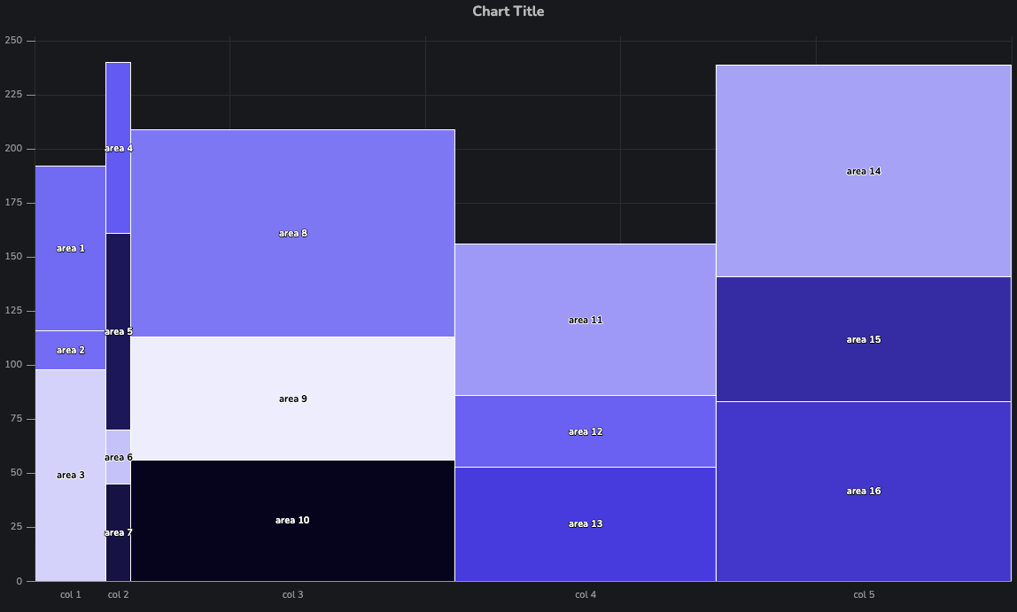
The above chart was produced by:
- Linking
Color Keyto the numeric columnareaColorValue - Linking
Color Configurationto a JSON object that describes the color scale:
{
  "kind": "colorScale",
  "config": {
    "colorStops": [
      [0, "#EFEFFF"],
      [0.67, "#4444FF"],
      [1, "#000022"]
    ]
  }
}
In the case of color scales, Color Configuration expects an object with:
kindbeingcolorScale- a nested object
configwith a propertycolorStops, which is an array of tuples, in which the first element is a value (0 to 1) at which the color is applied in the scale, and the second element is the color.
Color Mapping
When Color Key refers to a column in the data with string values, Color Configuration must define a color mapping -- a mapping between strings in the data and the color the area should be as a result.
In this section, we will be producing a chart where the areas are colored using a color mapping:
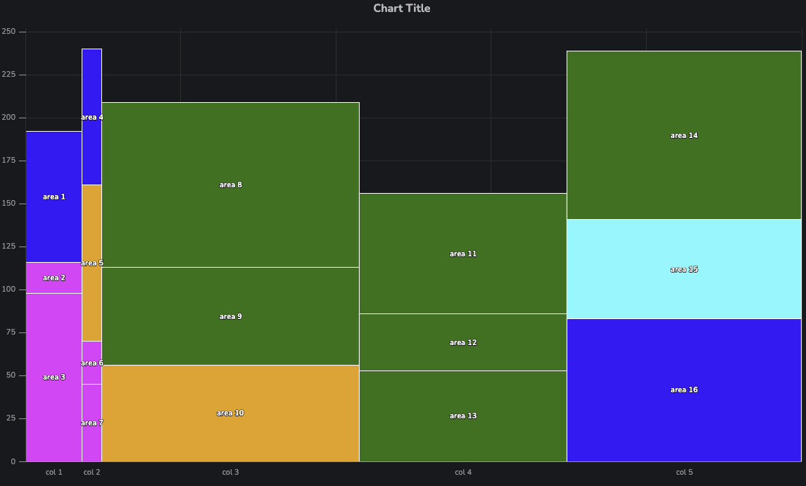
The above chart was produced by:
- Linking
Color Keyto the numeric columnareaStringValue - Linking
Color Configurationto a JSON object that describes the color mapping:
{
  "kind": "colorMap",
  "config": {
    "mapping": {
      "color 0": "green",
      "color 1": "cyan",
      "color 2": "magenta",
      "color 3": "orange"
    },
    "matchCase": false,
    "fallback": "blue"
  }
}
In the case of color mappings, Color Configuration expects an object with:
kindbeingcolorMap- a nested object
config, which contains an objectmappingwhich maps string values in the column specified byColor Keyto colors.
config also allows for the following optional configuration items:
matchCaseis a boolean which determines whether strings need to have the same case as the values inmappingto be mapped to colorsfallbackis a color to use in the event that a value in the column specified byColor keydoes not match any key inmapping.
Table to Marimekko Chart
The purpose of the Table to Marimekko Chart adaptor is to produce a Marimekko chart from "area" values alone, rather than the typical width and height values used to produce a variwide chart. Given all columns in a Marimekko chart have the same height, the entire chart can be constructed with a single value (area) per area.
In this section, we will be producing the following chart as an example:
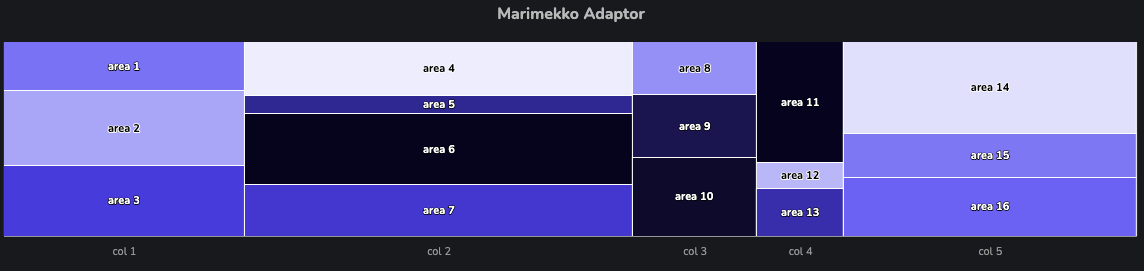
Table Data
This property should be linked to an SDD data source which will be used to generate the bars. Appendix 2: Marimekko Data Set describes the dataset in detail.
The data must, at a minimum, include:
- Column to specify which
categorythe area belongs to (multiple areas allocated to the same category result in stacking) (Category Key) - Column to determine the
valueof each area (Value Key). This can be thought of as the "magnitude" or "area" of this particular area.
Optionally, the data may include:
- Column to be used as the
nameof the area (appears as text laid over the area) (Name Key) - Column to be used to color the area (
Color Key). The values could be numeric and used with a color scale, or strings and used with a color mapping. See Color Key / Color Configuration.
In the above example, the following configuration has been provided:
Table Datais linked to the data described in Appendix 2: Marimekko Data SetValue Keyis linked toareaValueCategory Keyis linked tocategoryName Keyis linked toareaName
Area Label / Prefix / Suffix
The Table to Marimekko Chart results in a chart with tooltips that differ from the tooltips in the base component. This is because we are only dealing with area values, rather than width and height values.
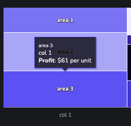
As a result, the means to customize the tooltip exist in the adaptor. The default tooltip produced by this adaptor looks like so:

By linking:
Area LabeltoProfit,Area Prefixto$Area Suffixtoper unit
The following tooltip is produced:
Filters
See Filters.
Color Key / Color Configuration
See Color Key / Color Configuration.
Tooltip Config Map
A mapping between columns in the SDD and a ValueFormatSpec object describing how to display the values in the tooltip.
While there is functionality for defining how values in tooltips are presented that are applied at the chart level, it is also possible to create tooltips for a series that reference other columns in the SDD apart from those that were used to create the areas itself.
This can be achieved by providing a configuration object to the tooltipConfigMap property of a series in this adaptor. This particular object maps columns in the SDD (in this case category, enumValue, percentValue and bigVariableValue) to ValueFormatSpec objects, as described in Appendix 4: Value Format Spec.
{
  "category": {
    "name": "Category",
    "index": 0
  },
  "enumValue": {
    "name": "Dept",
    "index": 1
  },
  "percentValue": {
    "name": "Utilization",
    "useLocale": true,
    "capitalize": true,
    "multiplier": "%"
  },
  "bigVariableValue": {
    "name": "NPV",
    "prefix": "$",
    "useLocale": true,
    "capitalize": false,
    "multiplier": "b",
    "index": 2
  }
}
Note: ValueFormatSpec does not typically include a name property - this is unique to the tooltip configuration for a given column. In this case, name is used to define the bold label shown per row.
In the case where name is not provided, the raw name of the column is used instead.
The index is an optional integer to specify the order of the entries when displayed in the tooltip. When index isn't specified, the entries are sorted alphabetically.
Table to Marimekko Chart (agg)
The Table to Marimekko Chart (agg) is much like the Table to Marimekko Chart adaptor, with the key difference being that values (such as the area values and color values) are to be aggregated.
In this section, we will be producing the following chart as an example:
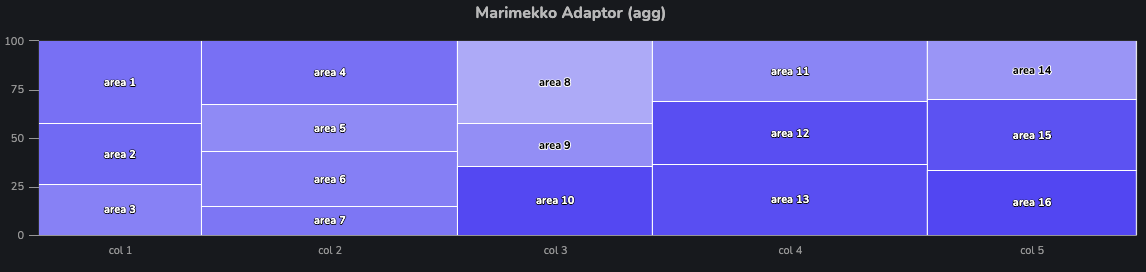
Table Data
This property should be linked to an SDD data source which will be used to generate the bars. Appendix 3: Marimekko Agg. Data Set describes the dataset in detail.
The data must, at a minimum, include:
- Column(s) that should be used as a group by key (
Group By Key(s)). This can be either a single string (in the case of a primary key) or an array of strings (in the case of a composite primary key). - Column to specify which
categorythe area belongs to (multiple areas allocated to the same category result in stacking) (Category Key).- Note that if the rows associated with the
Group By Key(s)contain more than one unique value forcategory, the chart will fail to render, showing an error message.
- Note that if the rows associated with the
- Column to determine the
valueof each area (Value Key). After aggregation, this can be thought of as the "magnitude" or "area" of this particular area.- The property
Value Agg Methoddetermines the way in whichvalues found byValue Keyare aggregated (See Aggregation Methods).
- The property
Optionally, the data may include:
- Column to be used as the
nameof the area (appears as text laid over the area) (Name Key) - Column to be used to color the area (
Color Key). The values could be numeric and used with a color scale, or strings and used with a color mapping. See Color Key / Color Configuration.
In the above example, the following configuration has been provided:
Table Datais linked to the data described in Appendix 3: Marimekko Agg. Data SetValue Keyis linked toareaValueValue Agg Methodis linked tosumCategory Keyis linked tocategoryName Keyis linked toareaName
See Color Key / Color Configuration / Color Agg Method to understand how the areas in this series was configured with an aggregated color scale.
Aggregation Methods
Since data is aggregated (with grouping specified via Group By Key(s)), multiple rows are expected to be found for any area's (composite) primary key. This means that in order to determine the value (area magnitude) and colorValue (from Color Key) for each area in the chart, multiple rows have to be aggregated to a single numeric value.
Acceptable values for Value Agg Method and Color Agg Method include:
sum: Sum all valuesmean: Take the mean of all valuesfirst: Use only the first value found
Filters
See Filters.
Area Label / Prefix / Suffix
See Area Label / Prefix / Suffix.
Color Key / Color Configuration / Color Agg Method
The configuration for this section is much the same as Color Key / Color Configuration, except for the need for a Color Agg Method for aggregating numeric values for color scales.
Color Agg Method
In the case where the chart's areas should be colored with a color scale, the multitude of numeric values found by Color Key have to be aggregated.
In the example for this adaptor, the following configuration was supplied to aggregate color keys and ultimately color the areas using a color scale:
Color Key: Linked toareaColorValueColor Agg Method: Linked tomeanColor Configuration: Linked to the following color scale configuration:
{
  "kind": "colorScale",
  "config": {
    "colorStops": [
      [0, "#EFEFFF"],
      [0.67, "#4444FF"],
      [1, "#000022"]
    ]
  }
}
How Color Mappings Work With Aggregation
Note that Color Agg Method is only applicable for color scales. sColor mappings will only ever use the first value found in the data for Color Key as the value to be used in the lookup mappings in Color Configuration.
Appendix 1: Variwide Data Set
The following data was used for the examples for the Table to Variwide Chart adaptor. The key thing to note is that width and height values come from the data explicitly.
{
  "data": [
    {
      "areaName": "area 1",
      "category": "col 1",
      "areaValue": 23,
      "widthValue": 17,
      "heightValue": 76,
      "areaColorValue": 48.994267750416284,
      "areaColorString": "color 4"
    },
    {
      "areaName": "area 2",
      "category": "col 1",
      "areaValue": 20,
      "widthValue": 17,
      "heightValue": 18,
      "areaColorValue": 47.62142300948873,
      "areaColorString": "color 2"
    },
    {
      "areaName": "area 3",
      "category": "col 1",
      "areaValue": 38,
      "widthValue": 17,
      "heightValue": 98,
      "areaColorValue": 10.437363271030243,
      "areaColorString": "color 2"
    }
    // etc
  ],
  "version": "1.0.0",
  "sddFormat": "sdd/table/array-of-objects",
  "validation": "enforced",
  "definitions": {
    "areaName": {
      "kind": "string",
      "optional": false
    },
    "category": {
      "kind": "string",
      "optional": false
    },
    "areaValue": {
      "kind": "number",
      "optional": false
    },
    "widthValue": {
      "kind": "number",
      "optional": false
    },
    "heightValue": {
      "kind": "number",
      "optional": false
    },
    "areaColorValue": {
      "kind": "number",
      "optional": false
    },
    "areaColorString": {
      "kind": "string",
      "optional": false
    }
  }
}
Appendix 2: Marimekko Data Set
The following data was used for the examples for the Table to Marimekko Chart adaptor. The key thing to note is that width and height of the columns is implicitly derived from the area values in the data.
{
  "data": [
    {
      "areaName": "area 1",
      "category": "col 1",
      "areaValue": 41,
      "areaColorValue": 48.47296644628803,
      "areaColorString": "color 0"
    },
    {
      "areaName": "area 2",
      "category": "col 1",
      "areaValue": 65,
      "areaColorValue": 29.912270263047034,
      "areaColorString": "color 2"
    },
    {
      "areaName": "area 3",
      "category": "col 1",
      "areaValue": 61,
      "areaColorValue": 71.48275263403757,
      "areaColorString": "color 4"
    }
  ],
  "version": "1.0.0",
  "sddFormat": "sdd/table/array-of-objects",
  "validation": "enforced",
  "definitions": {
    "areaName": {
      "kind": "string",
      "optional": false
    },
    "category": {
      "kind": "string",
      "optional": false
    },
    "areaValue": {
      "kind": "number",
      "optional": false
    },
    "areaColorValue": {
      "kind": "number",
      "optional": false
    },
    "areaColorString": {
      "kind": "string",
      "optional": false
    }
  }
}
Appendix 3: Marimekko Agg. Data Set
The following data was used for the examples for the Appendix 3: Marimekko Agg. Data Set adaptor. In this data set, groupByKey1 and groupByKey2 are used as a composite primary key for areas in the Marimekko diagram, and a total of 5 points per area were created (to be aggregated).
{
  "data": [
    {
      "areaName": "area 1",
      "category": "col 1",
      "areaValue": 74,
      "groupByKey1": "182a72b8-69b0-4896-ae33-a14bcad4ab53",
      "groupByKey2": "2f5a33fc-a385-4791-b5e1-c5c8fb5d2d99",
      "areaColorValue": 50.288901009181956,
      "areaColorString": "color 4"
    },
    {
      "areaName": "area 1",
      "category": "col 1",
      "areaValue": 43,
      "groupByKey1": "182a72b8-69b0-4896-ae33-a14bcad4ab53",
      "groupByKey2": "2f5a33fc-a385-4791-b5e1-c5c8fb5d2d99",
      "areaColorValue": 6.919983287121312,
      "areaColorString": "color 4"
    },
    {
      "areaName": "area 1",
      "category": "col 1",
      "areaValue": 45,
      "groupByKey1": "182a72b8-69b0-4896-ae33-a14bcad4ab53",
      "groupByKey2": "2f5a33fc-a385-4791-b5e1-c5c8fb5d2d99",
      "areaColorValue": 14.145210265400255,
      "areaColorString": "color 4"
    },
    {
      "areaName": "area 1",
      "category": "col 1",
      "areaValue": 65,
      "groupByKey1": "182a72b8-69b0-4896-ae33-a14bcad4ab53",
      "groupByKey2": "2f5a33fc-a385-4791-b5e1-c5c8fb5d2d99",
      "areaColorValue": 91.66312605820089,
      "areaColorString": "color 4"
    },
    {
      "areaName": "area 1",
      "category": "col 1",
      "areaValue": 19,
      "groupByKey1": "182a72b8-69b0-4896-ae33-a14bcad4ab53",
      "groupByKey2": "2f5a33fc-a385-4791-b5e1-c5c8fb5d2d99",
      "areaColorValue": 65.20325441517214,
      "areaColorString": "color 4"
    },
    {
      "areaName": "area 2",
      "category": "col 1",
      "areaValue": 17,
      "groupByKey1": "5549ab88-46d1-4b79-a0c4-5b1601298124",
      "groupByKey2": "8d5b0ba4-3c22-4a0c-aefd-924c0cda052f",
      "areaColorValue": 94.55067374978195,
      "areaColorString": "color 2"
    }
    // ... etc
  ],
  "version": "1.0.0",
  "sddFormat": "sdd/table/array-of-objects",
  "validation": "enforced",
  "definitions": {
    "areaName": {
      "kind": "string",
      "optional": false
    },
    "category": {
      "kind": "string",
      "optional": false
    },
    "areaValue": {
      "kind": "number",
      "optional": false
    },
    "groupByKey1": {
      "kind": "string",
      "optional": false
    },
    "groupByKey2": {
      "kind": "string",
      "optional": false
    },
    "areaColorValue": {
      "kind": "number",
      "optional": false
    },
    "areaColorString": {
      "kind": "string",
      "optional": false
    }
  }
}
Appendix 4: Value Format Spec
A value format spec (ValueFormatSpec) is a configuration object used in a variety of use cases, which enables creators to customize the way in which numeric values are displayed.
The configuration items available in a value format spec are defined by the following snippet:
type ValueFormatSpec = {
  prefix?: string
  suffix?: string
  multiplier?: 'm' | 'b' | 'k' | '1' | '%' | 'auto'
  dp?: number
  capitalize?: boolean
  useLocale?: boolean
}
prefixandsuffixare optional strings to display before/after each value, respectively.dpis the number of decimal points to round to, when dealing with floating point values.useLocaledefines whether numbers should be formatted according to the user's locale (as per their browser):- e.g.
10,000,000instead of10000000.
- e.g.
multiplierallows a number to be abbreviated according to the following patterns:- e.g.
mis associated with millions:10000000becomes10M2345000becomes2.36M
- e.g.
%is associated with percentages:0.55becomes55%10becomes1,000%(assuminguseLocaleistrue)
autowill choose an appropriate multiplier on a per-value basis.
- e.g.
capitalizeis a flag that specifies whether the suffix made by a multiplier should be capitalized. Consider the value10000000(10 Million):capitalizebeingtruewill cause the value to be displayed as10Mcapitalizebeingfalse`` will cause the value to be displayed as10m`
All of the above properties are considered optional. If any are omitted, the following defaults are typically applied:
{
  "prefix": "",
  "suffix": "",
  "multiplier": "auto",
  "dp": 1,
  "capitalize": true,
  "useLocale": true
}