Input
A input element for numeric or text data.
Properties
Value
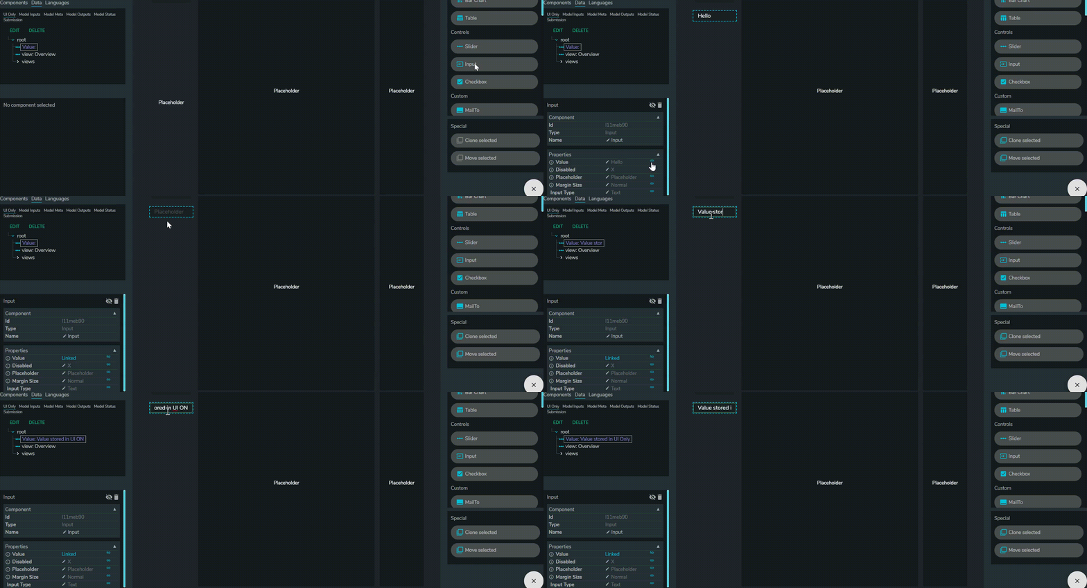
The value entered. Can be linked and stored in UI only
Disabled
On/Off. Off disables users from entering inputs.
Placeholder
Value shown when there are no inputs.
Margin size
Margin between input and border
- Dense
- Normal
- None
Input Type
- Number
- Locale Number
- Text
- Percent
- Currency
- Natural Number
- Integer
Multiple Lines
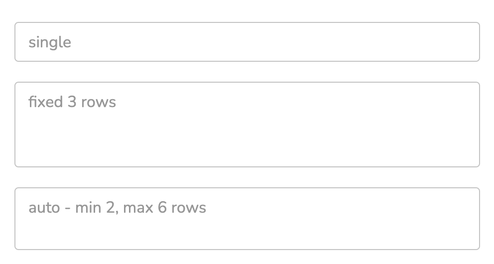
By default, the Input is a single-line textbox, but it can be configured to allow multi-line text input using the Multiple Lines: Method property.