Select
Properties
Choices
Choices to display in the dropdown. This is an array, with each entry corresponding to a row in the dropdown. Each entry can either be:
- A
string - An object of the form:
{ id: string, label: string }. In this form, thelabelis shown in the dropdown, but theidis used as theSelected Valueif this row is selected.
Ex:
["Row 1", { "id": "Row 2", "label": "different-label" }, "Row 3"]
Selected Value
The selected value of the dropdown. This will correspond to the string ID for the selected row. If this value is not linked to the store, you will not be able select a different row in the drop-down.
Label
The label to display next to the dropdown
Label Style
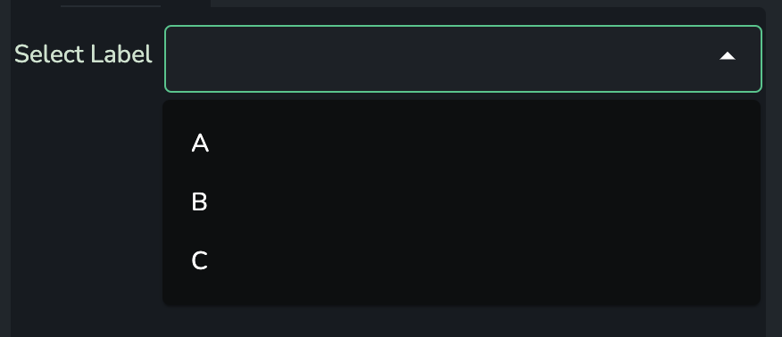
Left-aligned style
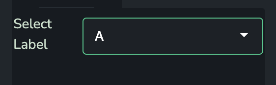
Inline style
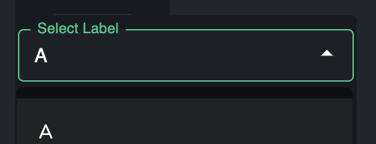
Enable typing to search
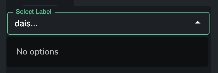
If enabled, the user will be able to type into the Select component to filter the dropdown
Automatically select first entry
If enabled, the Select component will make sure that the drop-down always has something selected. If nothing is selected, or if the Selected Value is not in the available Choices, then the component will select the first available row.
Note: if the Selected Value isn't linked up to the store, then this will have no effect.
Icon when collapsed
The icon to use for the collapsed view of this component. For example, when used in the left-hand side of the Collapsible Three Panel Layout
Adaptors
Table to sorted unique list
This adaptor transforms an Self Describing Data (SDD) table into data for this component. In this adaptor, each row in the SDD table will correspond to one row in the drop-down (if no filters are being used).
Table Data
This property should be linked to the SDD table.
Table Column
This property should be linked to a string, which is the name of a column in the SDD Table. This column will then be used to source the id and label of each row in the drop-down.
Filters
The applicable/available filters in this adaptor are more similar to those found elsewhere in Dais:
Available Filtersmay be linked to an object that maps filter names to filter specification objects. These objects containkey, avalueand a filtermethod.Applicable Filtersare a list of filter names in the object supplied toAvailable Filtersto apply.
The supported values that can be provided to method are:
"equal""contains""between""lt""gt""lte""gte"
An example configuration could be:
{
  "ApplicableFilters": ["MyFilter", "MyOtherFilter"],
  "AvailableFilters": {
    "MyFilter": {
      "key": "y",
      "value": 50,
      "method": "gte"
    },
    "MyOtherFilter": {
      "key": "value",
      "value": [90, 180],
      "method": "between"
    }
  }
}