Stepper
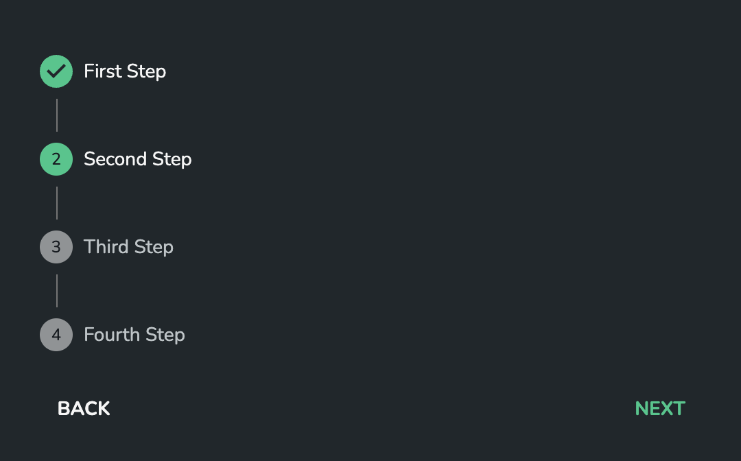
The Stepper component lets you convey progress through numbered steps. It provides a wizard-like workflow.

Properties
Steps
Configuration of the steps to be display on the Stepper. Array of objects of the form: { label: string, optional?: boolean }. Each entry in the array will result in a numbered step on the Stepper. label refers to the text next to each step, and optional refers to the step being optional, meaning it can be skipped.
For example:
[
  { "label": "First step" },
  { "label": "Second step", "optional": true },
  { "label": "Third step", "optional": true },
  { "label": "Fourth step" },
]
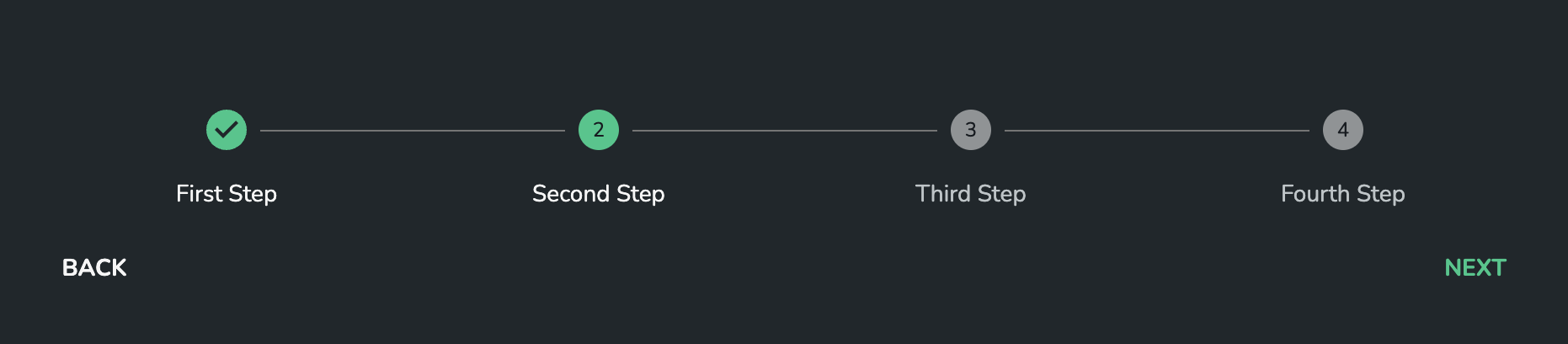
Display alternative label
Sets the position of labels to be placed below the step icon.
Padding
Padding to be use around the control. It is set to 0px by default. The value should be set in valid CSS values, for example 5px, 1em, 0.5rem.
Display Options
Orientation
(optional)
Defines the way in which steps are laid out within the available space. Available options:
horizontalvertical
Defaults to horizontal