Canvas (Adding Tabs)
The Dais Canvas defines an area for holding UI components in different tabs. An example is shown below:
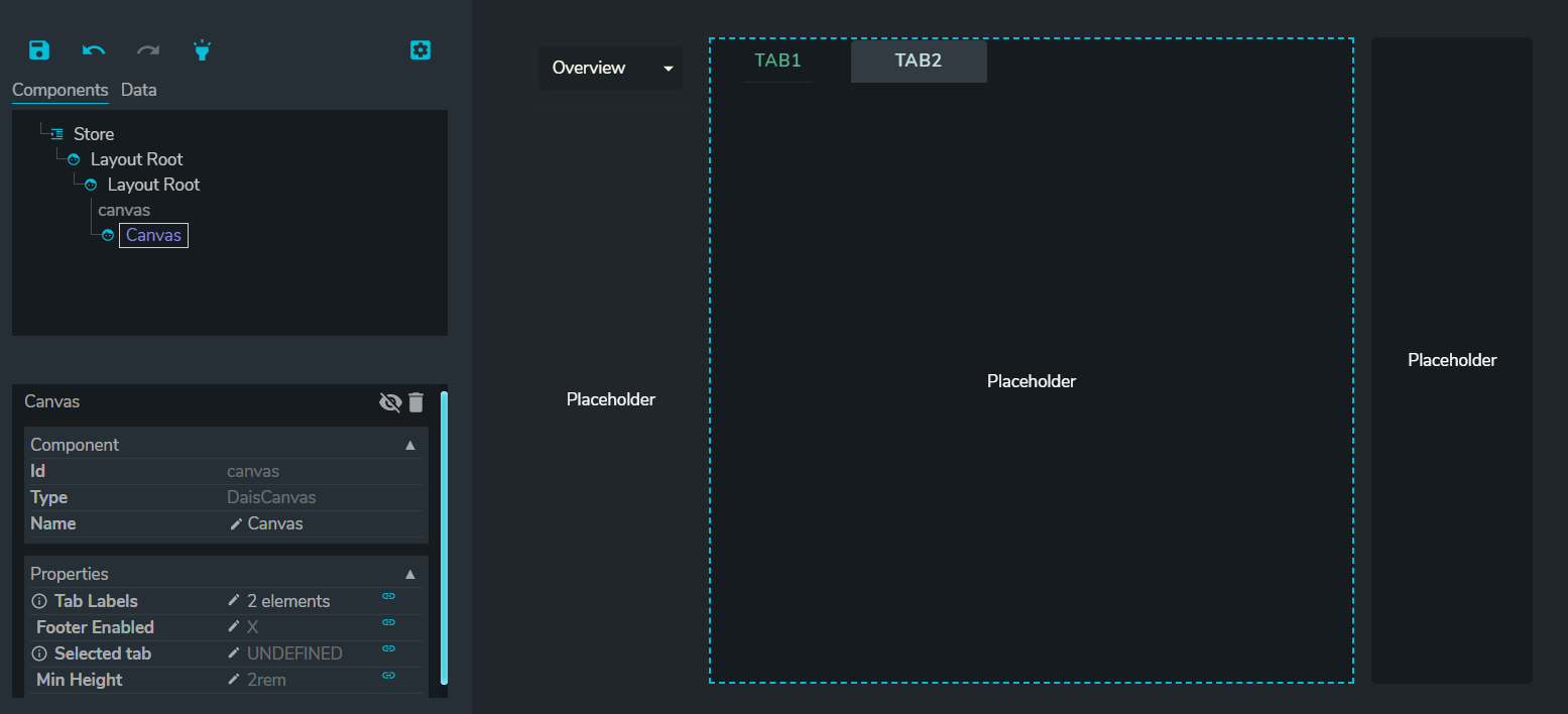
Properties
Tab Labels:
List of tabs to switch between in the following format:
["tab 1", "tab 2",...]
Note: Contents inside a tab is linked to the name of the tab. If you rename a tab, the original contents will disappear. To retrieve the content, rename the tab back to the original name, move the content to another area, rename the tab and move the contents back.
An alternative format for the labels are:
[{ id: 'tab1', label: 'Tab 1' }, { id: 'tab2', label: 'Tab 2', tooltip: 'Tooltip text' }]
Canvas defined using this format are linked to value id instead of label. To change the canvas label displayed, simply update the content in label and the content won't be lost.
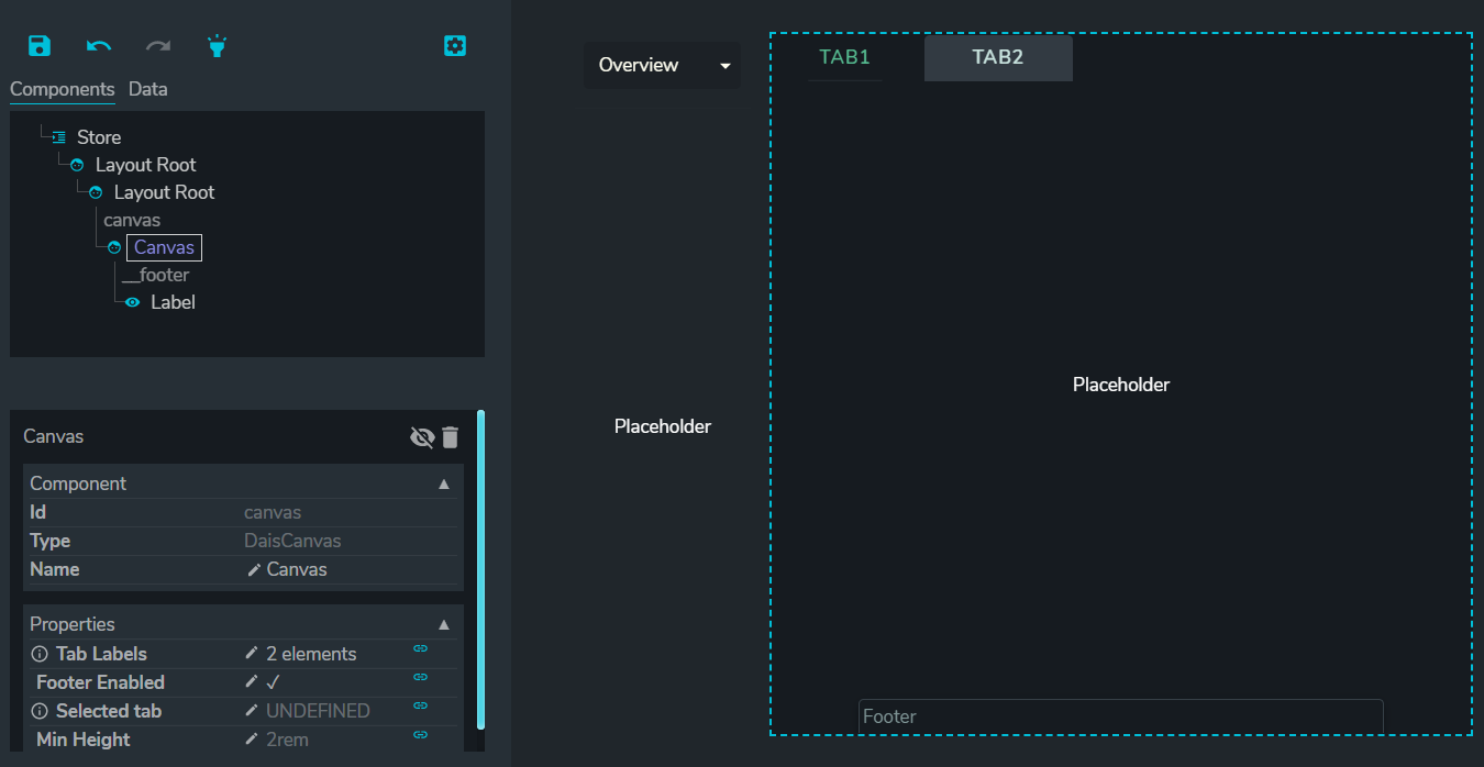
Footer Enabled
Allows users to add a footer that can be viewed across all tabs. e.g.
Selected Tab
Links the name of the selected tab to a variable. This can be used if you have the same tab across multiple views and want the same tab to be selected when you switch views.
Min Height
Minimum height of the canvas. Used to adjust height to fill entire space e.g. in container. Height units are in "rem".
Canvas vs Tabs
Canvas and Tabs are very similar components with major difference in visual appearance. See Tabs for comparison between Canvas and Tabs.