Interactive SVG
Important Information About CSS
During Configuration of Data Source, Tooltips etc. you will need to provide data, that specifies, in which element changes will be implemented or tooltips will be added etc. This data are CSS Selectors.
What Are Parent Element And Children Elements?
IMPORTANT: Definition below is not an exactly same as CSS docs definition, but it is adjusted to fit in the best way behaviour of our components. User should follow this definition while adding values to Parent Id, Parent Class, Children Id, Children Class
If there is an element A and inside it there are elements: B, C and inside C is element D.
A is parent element for B, C and D.
C is a parent element for D.
D is a child element for C and A.
B, C and D are children elements for A.
Classes and Ids
Element's class is a value assigned to class attribute in HTML tag
Element's id is a value assigned to id attribute in HTML tag
Properties: Parent Id, Parent Class, Children Id, Children Class
In these properties, user should provide just name of the class or id, without any prefixes or suffixes
Property: CSS Selector
This property is much different, then previous ones, user should provide here valid CSS Selector according to its docs. If user provide anything here, previous properties will be ignored.
General rules of CSS Selectors:
Prefix for id is
#and for class is..
Examples:id="idName"-> CSS Selector =#idName
class="className"-> CSS Selector =.classNameYou can use tag names inside selectors too.
If you want to select sth, what is inside sth else you need to provide classes/ids/tag names etc. in specific order. In general, if you want to select element B, which is inside element A, you should provide A first and than B.
Example: CSS Selector:#stockyard_9 tspanmeans, that you are looking for HTML tagtspan, which is inside element with idstockyard_9.
Useful links
CSS Selectors
CSS Selectors - less reliable source
Displaying SVG Image
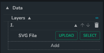
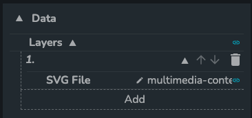
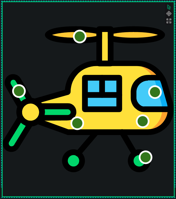
- To display SVG Image inside the component you need to create a layer based on
.svgfile. You can do it inLayersproperty, by providing file directly from the disc of your computer (UPLOADoption) or by choosing one from the files already uploaded to DAIS (SELECToption).
Modifying SVG Image
This component allows user to modify colors and texts inside SVG image. To do this, user needs to provide valid config data to
Data Sourceproperty. What's important, this feature might work in two different ways based on boolean value ofProvide Only Difference Since Last Stateproperty.
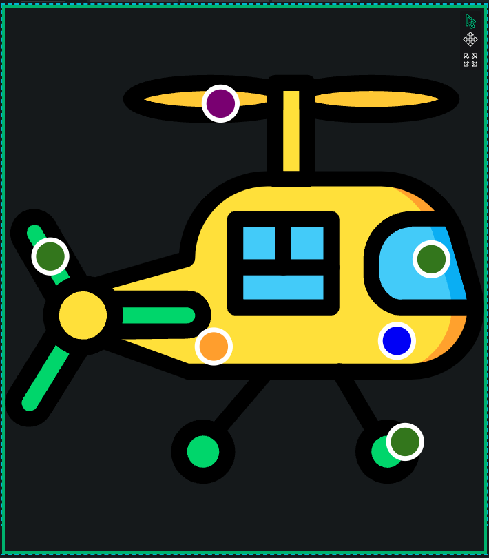
If this property is set tofalse, changes specified inData Sourceare mirrored in SVG image. If change is being removed fromData Source, specific element in SVG image returns to its default state.
However ifProvide Only Difference Since Last Stateis set totrue, removing change fromData Sourcedoesn't not cause returning of specific element to default state.
Example of behaviour withProvide Only Difference Since Last Stateset totrue:
Color of element A isred-> User changes its color toblueby adding config of this change toData Source-> Element A becomesblue-> User removes config of this change fromData Source-> Element is stillblue-> User changes color of the element to default (red) by adding config of this change toData Source-> Element becomesred-> User removes config of this change fromData Source-> Element is stillredExample of
Data Sourceconfig:
{
    "sddFormat": "sdd/table/array-of-objects",
    "version": "1.0.0",
    "definitions": {
        "parentId": {
            "kind": "string",
            "optional": true
        },
        "parentClass": {
            "kind": "string",
            "optional": true
        },
        "childrenId": {
            "kind": "string",
            "optional": true
        },
        "childrenClass": {
            "kind": "string",
            "optional": true
        },
        "selector": {
            "kind": "string",
            "optional": true
        },
        "fill": {
            "kind": "string",
            "optional": true
        },
        "text": {
            "kind": "string",
            "optional": true
        }
    },
    "data": [
        {
            "parentId": "dot_body",
            "fill": "blue"
        },
        {
            "selector": "#dot_engine",
            "fill": "orange"
        },
        {
            "selector": "#dot_rotor_blade",
            "fill": "purple"
        }
    ]
}
Data Sourceallows user to config changes in many ways. All possible properties are listed and described below.
IMPORTANT: All properties are marked as optional, but usually it's needed to provide value to at least one property from:Parent Id,Parent Class,Children Id,Children Class,CSS Selectorand at least one from:FillandText.- Parent Id (optional) <br/>
Id of the parent of the element, you want to select.
- Parent Class (optional) <br/>
Class of the parent of the element, you want to select.
- Children Id (optional) <br/>
Id of target svg element.
- Children Class (optional) <br/>
Class of target svg element.
- CSS Selector (optional) <br/>
CSS selector pointing to target svg element. i.e. '#id .class'.
- Fill (optional) <br/>
Html color to overwrite in selected svg element.
- Text (optional) <br/>
Text to overwrite in selected svg element.
Selecting Data
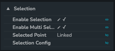
There is a selection feature in this component, which might be enabled by setting
Enable Selectionvalue totrue. Another necessary thing to use this feature is to linkSelected Pointproperty to a point in the store. There is an option to enableEnable Multi Selectionto be able to select many points at the same time. Then the last thing is to configureSelection Configproperty, basically this property holds information what is selectable and what value should be assigned to point specified inSelected Pointduring selection.Furthermore, there is a way to unselect elements, that were already selected, by clicking on them one more time.
Example of selection config:
{
    "sddFormat": "sdd/table/array-of-objects",
    "version": "1.0.0",
    "definitions": {
        "parentId": {
            "kind": "string",
            "optional": true
        },
        "parentClass": {
            "kind": "string",
            "optional": true
        },
        "childrenId": {
            "kind": "string",
            "optional": true
        },
        "childrenClass": {
            "kind": "string",
            "optional": true
        },
        "selector": {
            "kind": "string",
            "optional": true
        },
        "id": {
            "kind": "string",
            "optional": true
        }
    },
    "data": [
        {
            "childrenId": "dot_tail_rotor",
            "id": "tail_rotor"
        },
        {
            "parentId": "dot_rotor_blade",
            "id": "rotor_blade"
        },
        {
            "selector": "#dot_engine",
            "id": "engine"
        }
    ]
}
Selection Configallows user to configure selecting functionality in many ways. All possible properties are listed and described below.
IMPORTANT: Many properties are marked as optional, but it's needed to provide value to at least one property from:Parent Id,Parent Class,Children Id,Children Class,CSS Selector- Parent Id (optional) <br/>
Id of the parent of the element, you want to select.
- Parent Class (optional) <br/>
Class of the parent of the element, you want to select.
- Children Id (optional) <br/>
Id of target svg element.
- Children Class (optional) <br/>
Class of target svg element.
- CSS Selector (optional) <br/>
CSS selector pointing to target svg element. i.e. '#id .class'.
- Id <br/>
ID that is used during selecting.
Using tooltips
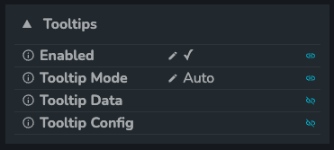
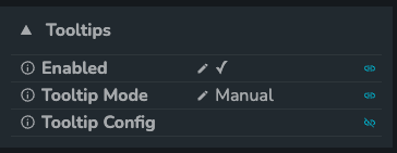
- This component has tooltips functionality, which means, that there is an option to display pop-ups while hovering over specific elements. To enable this funtionality, it's needed to set
EnabledinTooltipssection totrue. What's important tooltips can work in two different modesAutoandManual, user can choose one of them inTooltip Modeproperty.
Tooltip Mode: Auto
In this mode everything works similar to other charts in DAIS. User provides SDD data to
Tooltip Data, this data consist of selector column and one/many column(s) with values. You can think about each row ofTooltip Dataas a point in chart, because it might have many values assigned to it. Which of them should be displayed in tooltip and how they should be formatted is controlled byTooltip Configproperty.For example:
- There are values assigned to elements in
Tooltip Data:- Element
e1hasv1:10,v2:20andv3:30 - Element
e2hasv1:100,v2:200andv3:300 - Element
e3hasv1:101andv2:202 - Element
e4hasv3:303andv4:400
- Element
- There are active tooltips specified in
Tooltip Config:v3v4
- Component looks for elements in
Tooltip Data, that havev3value orv4value. - Elements
e1ande2display tooltip with value ofv3 - Element
e3doesn't display any tooltip - Element
e4display tooltip with values of bothv3andv4
- There are values assigned to elements in
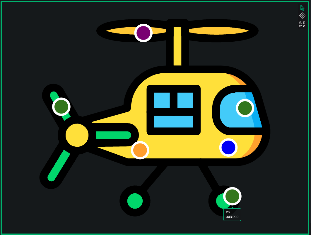
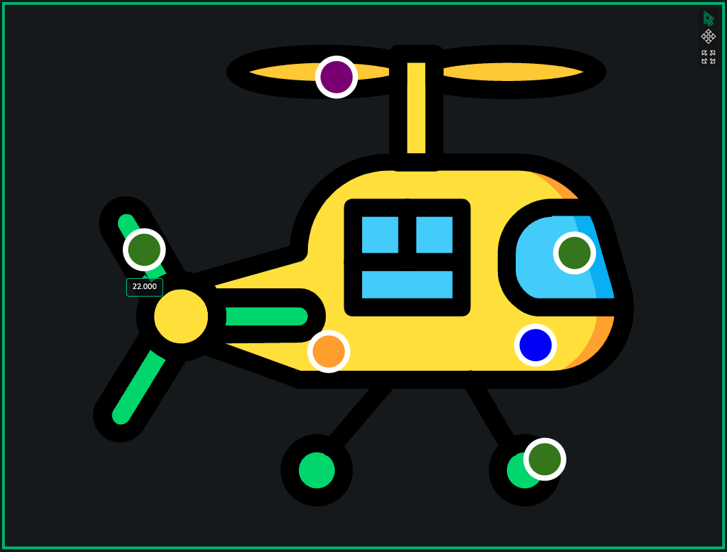
Example of Tooltip Data and Tooltip Config:
Tooltip Data:
{
    "sddFormat": "sdd/table/array-of-objects",
    "version": "1.0.0",
    "definitions": {
        "id": {
        "kind": "string",
        "optional": true,
        },
        "selector": {
        "kind": "string",
        "optional": true,
        },
        "value1": {
        "kind": "string",
        "optional": true,
        },
        "value2": {
        "kind": "number",
        "optional": true,
        },
        "value3": {
        "kind": "string",
        "optional": true,
        },
        "alignment": {
        "kind": "string",
        "optional": true,
        },
    },
    "data": [
        {
        "selector": "#dot_rotor_blade",
        "value1": "v1",
        "value2": 2,
        },
        {
        "selector": "#dot_tail_rotor",
        "value1": "v10",
        "value2": 22,
        },
        {
        "selector": "#dot_landing_skid",
        "value1": "v100",
        "value2": 303,
        "value3": "v3",
        },
    ],
}
Tooltip Config:
{
    "sddFormat": "sdd/table/array-of-objects",
    "version": "1.0.0",
    "definitions": {
        "column": {
            "kind": "string",
            "optional": true
        },
        "prefix": {
            "kind": "string",
            "optional": true
        },
        "suffix": {
            "kind": "string",
            "optional": true
        },
        "isNumeric": {
            "kind": "boolean",
            "optional": true
        },
        "multiplier": {
            "kind": "string",
            "optional": true
        },
        "decimalPlaces": {
            "kind": "number",
            "optional": true
        },
        "decimalPlacesMode": {
            "kind": "string",
            "optional": true
        },
        "capitalize": {
            "kind": "boolean",
            "optional": true
        },
        "useLocale": {
            "kind": "boolean",
            "optional": true
        }
    },
    "data": [
        {
            "column": "value3",
            "prefix": "",
            "suffix": "",
            "isNumeric": false,
            "multiplier": "auto",
            "decimalPlaces": 1,
            "decimalPlacesMode": "alwaysShow",
            "capitalize": true,
            "useLocale": true
        },
        {
            "column": "value2",
            "prefix": "",
            "suffix": "",
            "isNumeric": true,
            "multiplier": "auto",
            "decimalPlaces": 3,
            "decimalPlacesMode": "alwaysShow",
            "capitalize": true,
            "useLocale": true
        }
    ]
}
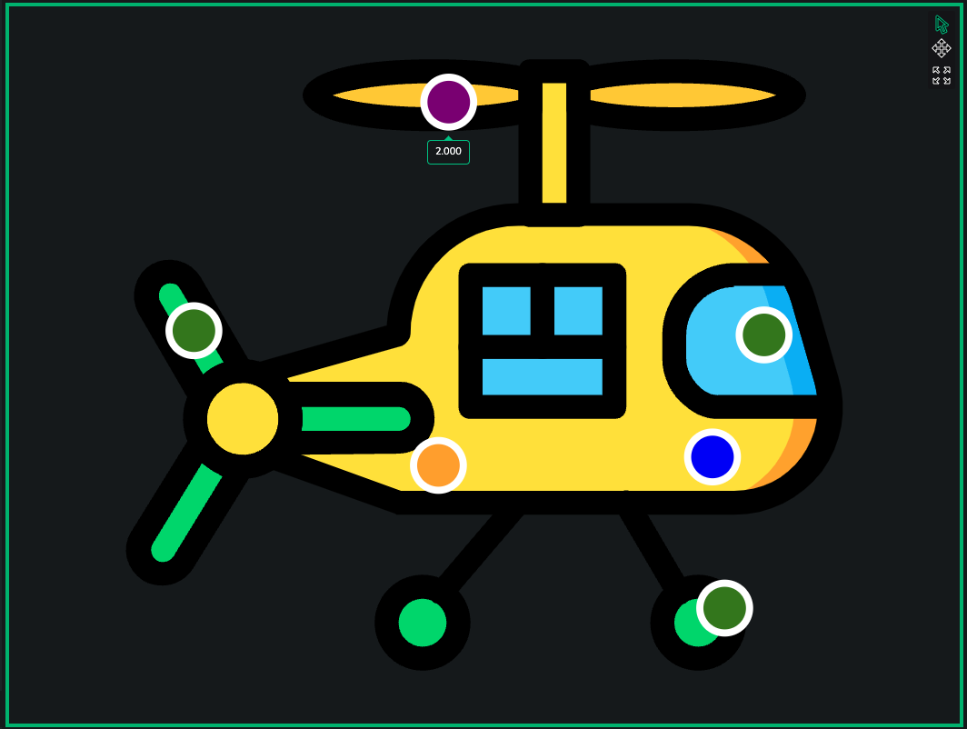
All possible properties of
Tooltips Data:selector
CSS selector pointing to target svg element. i.e. '#id .class'.alignment (optional)
Alignment of the tooltip. Valid options are:top,centerandbottomother
Other columns with data, which are used to be displayed in a tooltip.
All possible properties of
Tooltip Config:column
Name of field inTooltip Data, whose value should be displayed in tooltip.prefix (optional)
Text to display at the beginning of the tooltip.suffix (optional)
Text to display at the end of the tooltip.isNumeric (optional)
Setting to determine if tooltip value is numeric.multiplier (optional)
Specifies rounding of numeric value - up to thousands, millions etc.decimalPlaces (optional)
The number of decimals displayed in a number.decimalPlacesMode (optional)
Specifies if last decimals with "0" character should be shown.capitalize (optional)
Specifies if unit sign should be capitalized, like M - millions etc.useLocale (optional)
Specifies if value should be formatted according to local rules (numbers are sometimes written differently in different countries).
Tooltip Mode: Manual
To set up tooltips in this mode, user needs to provide config data to
Tooltip Configproperty. Config data holds information about: what elements should display tooltip while hovering, what data should be displayed inside tooltip and how tooltip should be formatted.Basically
Tooltip Configis a list of all tooltips with information when they should be visible.
- Example of
Tooltip Config:
{
    "sddFormat": "sdd/table/array-of-objects",
    "version": "1.0.0",
    "definitions": {
        "parentId": {
            "kind": "string",
            "optional": true
        },
        "parentClass": {
            "kind": "string",
            "optional": true
        },
        "childrenId": {
            "kind": "string",
            "optional": true
        },
        "childrenClass": {
            "kind": "string",
            "optional": true
        },
        "selector": {
            "kind": "string",
            "optional": true
        },
        "column": {
            "kind": "string",
            "optional": true
        },
        "alignment": {
            "kind": "string",
            "optional": true
        },
        "prefix": {
            "kind": "string",
            "optional": true
        },
        "suffix": {
            "kind": "string",
            "optional": true
        },
        "isNumeric": {
            "kind": "boolean",
            "optional": true
        },
        "multiplier": {
            "kind": "string",
            "optional": true
        },
        "decimalPlaces": {
            "kind": "number",
            "optional": true
        },
        "decimalPlacesMode": {
            "kind": "string",
            "optional": true
        },
        "capitalize": {
            "kind": "boolean",
            "optional": true
        },
        "useLocale": {
            "kind": "boolean",
            "optional": true
        },
        "data": {
            "kind": "string",
            "optional": true
        },
        "data2": {
            "kind": "string",
            "optional": true
        }
    },
    "data": [
        {
            "childrenId": "dot_body",
            "column": "data",
            "prefix": "",
            "suffix": "",
            "isNumeric": false,
            "multiplier": "k",
            "decimalPlaces": 1,
            "decimalPlacesMode": "alwaysShow",
            "capitalize": true,
            "useLocale": true,
            "data": "body tooltip",
            "data2": "body tooltip 2",
            "alignment": "top"
        },
        {
            "selector": "#dot_rotor_blade",
            "column": "data",
            "prefix": "",
            "suffix": "",
            "isNumeric": false,
            "multiplier": null,
            "decimalPlaces": null,
            "decimalPlacesMode": null,
            "capitalize": null,
            "useLocale": null,
            "data": "rotor blade tooltip",
            "data2": "rotor blade tooltip ",
            "alignment": "bottom"
        },
        {
            "selector": "#dot_engine",
            "column": "data2",
            "prefix": "",
            "suffix": "",
            "isNumeric": false,
            "multiplier": null,
            "decimalPlaces": null,
            "decimalPlacesMode": null,
            "capitalize": null,
            "useLocale": null,
            "data": "engine tooltip",
            "data2": "engine tooltip 2",
            "alignment": "center"
        },
        {
            "parentId": "dot_landing_skid",
            "column": "data2",
            "prefix": "",
            "suffix": "",
            "isNumeric": null,
            "multiplier": null,
            "decimalPlaces": null,
            "decimalPlacesMode": null,
            "capitalize": null,
            "useLocale": null,
            "data": "landing skid tooltip",
            "data2": "landing skid tooltip 2",
            "alignment": "bottom"
        },
        {
            "parentId": "dot_landing_skid",
            "column": "data2",
            "prefix": "",
            "suffix": "",
            "isNumeric": null,
            "multiplier": null,
            "decimalPlaces": null,
            "decimalPlacesMode": null,
            "capitalize": null,
            "useLocale": null,
            "data": "landing skid tooltip",
            "data2": "landing skid tooltip 2 - double",
            "alignment": "bottom"
        }
    ]
}
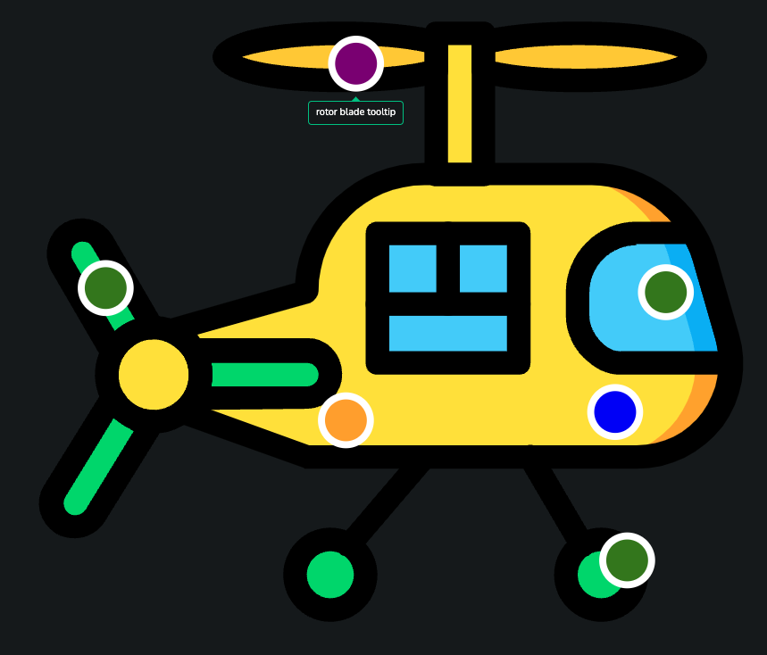
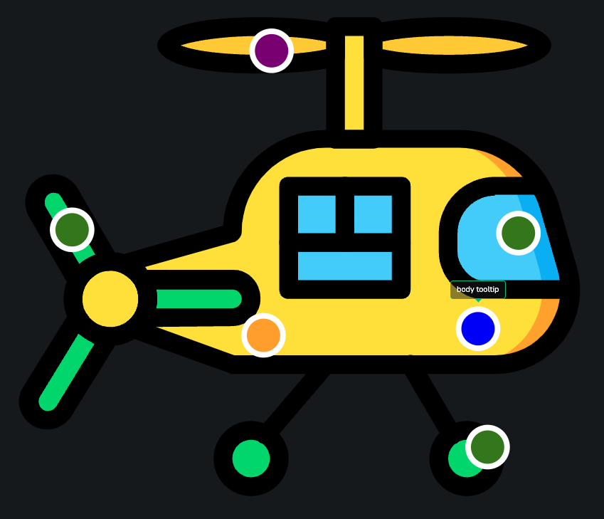
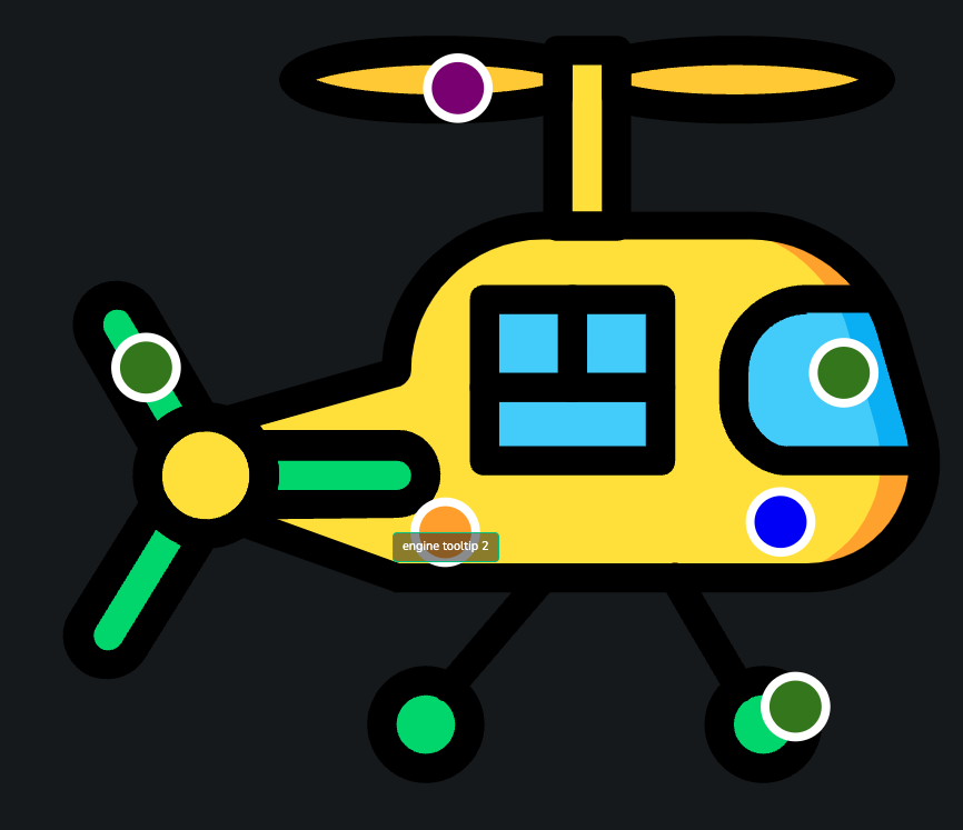
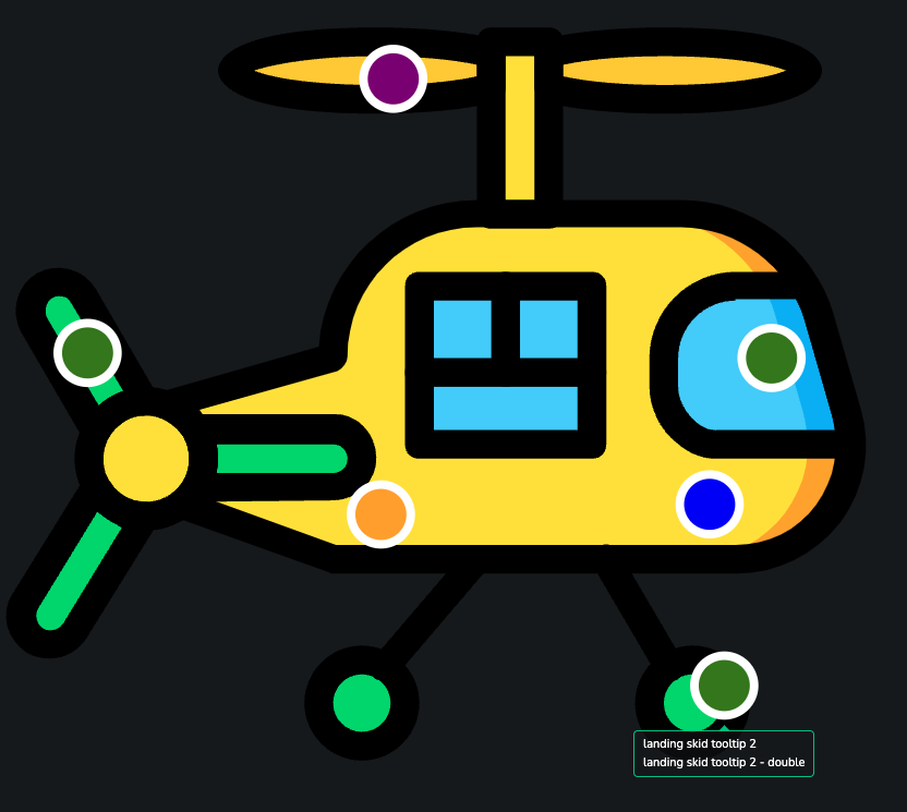
Tooltip Configallows user to configure tooltip functionality in many ways. All possible properties are listed and described below.
IMPORTANT: Many properties are marked as optional, but it's needed to provide value to at least one property from:Parent Id,Parent Class,Children Id,Children Class,CSS Selector- parentId (optional)<br/>
Id of the parent of the element, you want to select.
- parentClass (optional) <br/>
Class of the parent of the element, you want to select.
- childrenId (optional) <br/>
Id of target svg element.
- childrenClass (optional) <br/>
Class of target svg element.
- selector (optional) <br/>
CSS selector pointing to target svg element. i.e. '#id .class'.
- column <br/>
Name of column, in which data to display in tooltip is stored.
- alignment (optional) <br/>
Alignment of the tooltip. Valid options are: `top`, `center` and `bottom`.
- prefix (optional) <br/>
Text to display at the beginning of the tooltip.
- suffix (optional) <br/>
Text to display at the end of the tooltip.
- isNumeric (optional) <br/>
Setting to determine if tooltip value is numeric.
- multiplier (optional) <br/>
Specifies rounding of numeric value - up to thousands, millions etc.
- decimalPlaces (optional) <br/>
The number of decimals displayed in a number.
- decimalPlacesMode (optional) <br/>
Specifies if last decimals with "0" character should be shown.
- capitalize (optional) <br/>
Specifies if unit sign should be capitalized, like M - millions etc.
- useLocale (optional) <br/>
Specifies if value should be formatted according to local rules (numbers are sometimes written differently in different countries).
- other <br/>
Other columns with data, which is used to be displayed in a tooltip. The currently used column is specified in `column` prop. User can create only one column, if there is no need for more.
Other Options
- This component allows user to modify much more, than mentioned above. User has control over borders, available toolts etc.
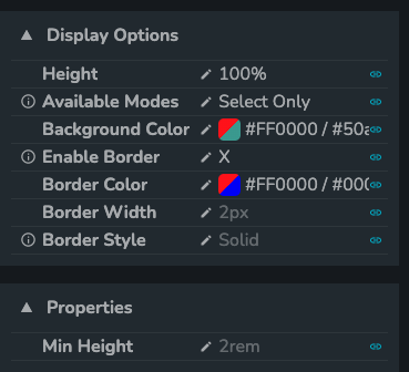
Size of the component might be controlled by modifying
Heightproperety orMin heightproperty. What's important, user can use to controlHeightnot onlypxvalues, but%values too.There is an option to specify how user can interact with svg image by selecting one of option from
Available Modes. If more than one mode is available, there is toolbar displayed, in which user can switch between modes.Background color might be specified by a user. By default it's set to transparent.
Border might be enabled/disabled by setting value to
Enable Border, its color is being modified byBorder Colorproperty and its width is being controlled byBorder Widthproperty. Furtheremore there is theBorder Styleproperty, which allows user to control style of the border, possible values aresolid,dashedanddotted.All properties related to functionalities mentioned above:
Height (optional)
Height of the SVG component.Available Modes
Specifies which modes of displaying data are available (Zoom/Pan Only,Select OnlyorSelect And Zoom/Pan Available). IfSelect and Zoom/Pan Availableis selected, there is toolbar displayed, which allows user to switch between two available modes.Background Color
Specifies color of the background. There might be different color specified for dark and light theme.Enable Border
Setting to show/hide borders.Border Color
Color of the border.Border Width
Width of the border.Border Style
Style of the border.Min Height (optional)
Minimum height of the SVG Component