Data Grid
A Data Grid displays data in table, complete with headers, sorting, column alignment and more.
Getting Started
A Data Grid needs to connect to a Data Source in order to display content. Any data source that uses the SSD format can be displayed.
An example SDD is:
{
  data: {
    'col-1': [
      'text1',
      'text2',
      'text3',
    ],
    'col-2': [
      '123',
      '234',
      '123',
    ],
    'col-3': [
      'true',
      'true',
      'false',
    ],
    'col-4': [
      1658514028000,
      1658543028000,
      1658512028000,
    ],
    'col-5': [
      '25',
      '32.6',
      '33.9',
    ],
  },
  definitions: {
    'col-1': {
      kind: 'string',
      optional: true,
    },
    'col-2': {
      kind: 'string',
      optional: true,
    },
    'col-3': {
      kind: 'string',
      optional: true,
    },
    'col-4': {
      kind: 'number',
      optional: true,
    },
    'col-5': {
      kind: 'string',
      optional: true,
    },
  },
  version: '1.0.0',
  sddFormat: 'sdd/table/object-of-arrays',
}
Configure Columns
You can configure how the SDD is displayed using the Columns property.
If the columns need to be displayed in an order that's different from the Data Source, you can use customize the order using a list of column names or the Config property below.
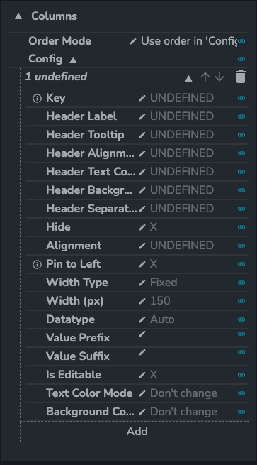
It is recommended to use the Config approach, as it provides more options as to how data is displayed.
Here is an example configuration using the previous example SDD:
- Select
col-2forKeyand put inIDunderHeader Label. The first column of the Data Grid should have headerIDand values123,234. - Click
Addat the bottom of the config panel, a new config panel should pop up. Selectcol-1forKey. - Click
Addfor a new config panel. Selectcol-3forKeyandBooleanunderData Type, then toggleIs Editableto True andDisplay Boolean AsSwitch Box. Users may update the status from True to False and vice versa. - Add one more config panel, this time to configure
col-4.col-4is in Unix time in milliseconds but that's not very human-readable. To convert Unix time toDateorDatetime, simply update the selection underData Typeoption. col-5can be configured as a monetary amount. SelectNumberunderData Typeand type$underValue Prefix. If the amounts are in thousands or millions, typekormunderValue Suffix.- You can optionally move the switch box column under
col-3to the right side of the data grid by clicking on the downward arrow next tocol-3until it reaches the end of the list

Notable mentions:
- There are more data types available, including an
Actionstype tat allows the value selected to be passed into a trigger based workflow. - At times, you may want to omit certain columns or display columns on request. This can be achieved by using the
Hideproperty. Width Typeset toDynamicwould allow the width of the column to be adjusted with content width.
Grouping
The Data Grid also allows rows under the same category to be grouped.
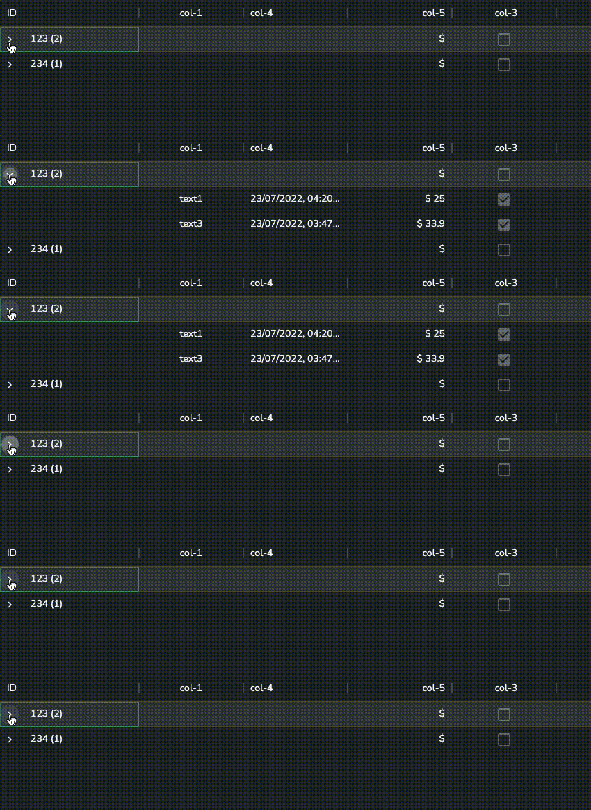
To enable Grouping, toggle Enable Collapsible Rows to True.
Following from the example above, select col-2 as Group By Key to make the grouping key ID.
Row Selections
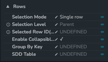
By default, enabling row selection will return the ID of the row like 0 and 4 which refers to the row count of the data source with zero indexing.
If an ID Key is defined, row selection will return the value(s) in ID Key column. i.e. '123', '234' if col-3 were specified as ID Key using the above example.
Users may select Single row or Multiple rows selection under Selection Mode. As name suggests, Single row selection will allow at most one row selected at any time, while Multiple rows selection allows for more than one row selected at a time.
The biggest difference aside from the obvious was actually the data formats returned: Single row selection always returns a single value such as 0, '123' when a row is selected, whereas Multiple rows selection returns an empty array [] when no row were selected amd an array of ID's when row(s) are selected [0], ['123', '234'].
With the complication of grouping, users may also select whether to pick Child or Parent for Selection Level. As name suggests, when Child mode is selected, user needs to expand on the grouping to select each individual child row; while Parent selection level would return selections with values from the grouping column.
Note: the example above would not have unique ID Key in Child selection mode. Create a new column with unique ID and define as ID Key before preceding.
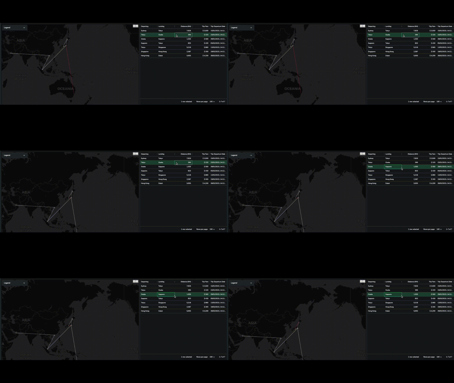
The Data Grid selection properties can be connected to other components to update the UI when selection changes.
Additional Resources
There are more resources available for the Gantt Chart component, including:
- Technical Documentation - See the Technical Reference Guide for more information.