Heading
Properties
Text
The text to display in the component
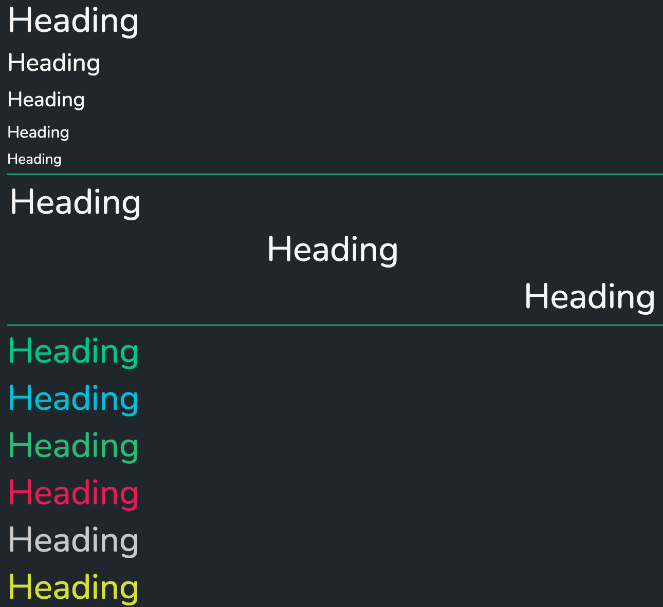
Header Size
The heading size to use in the component. The available sizes are:
LargestLargeMediumSmallSmallest
Align
The alignment to use for the text. The available alignments are:
LeftCenterRightJustify
Color
The color to use for the text. The available colors are:
UnsetGreenRedBody
Override Font Size
Set the specific font size, in CSS units. This overrides 'Header Size'. Examples: 18px, 12pt, 3rem.
Enable chart title style
Whether to emulate the Dais chart title in this component. This will override all other options.