Loading Spinners
With workflows, App Builder can automatically detect when to display loading spinners to the user. Loading spinners are configured for each Workflow Output.
There are 3 different options for loading spinners - configured via the Steps configuration panel when an Output is selected.
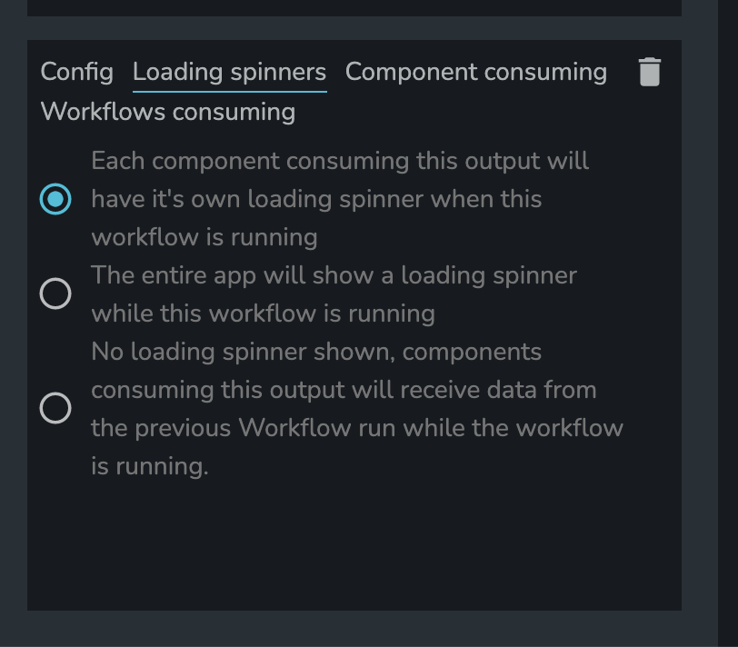
Per-component Loading Spinner
This is the default behavior. When a component has a property linked up to the Workflow Output, and the workflow is running, the component will be hidden by a loading spinner. Once the workflow has finished running (or when even steps have run to provide the output data), the component will be shown.
Global Loading Spinner
With this option, the entire app will be hidden by a loading spinner when the workflow is running. This is useful for workflows that run on page load - for example, to fetch data from the model before the first view of the app is shown to the user.
No Loading Spinner
With this option, no loading spinner will be shown. When a component has a property linked up to the Workflow Output, and the workflow is running, the component will receive the result from the last workflow run. If the workflow has not been run previously, then the component will receive the 'default' data (which you must configure when you select this option).
When will Loading Spinners be Shown?
Loading spinners will not always be shown when the workflow is running. For simple workflows that do not contain any asynchronous steps, loading spinners will not be used.
Example
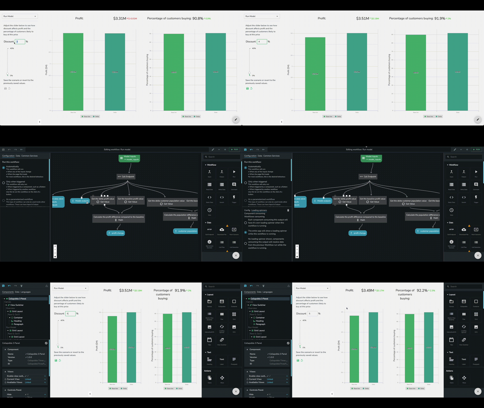
The following app has Per-component Loading Spinner initially. There are 4 spinners on screen when "discount rate" is increased from 3% to 4%. After configured the loading spinners to Global Loading Spinner in workflow. There is a big loading spinner that takes over the entire page when the discount rate is increased from 4% to 5%.