Legend
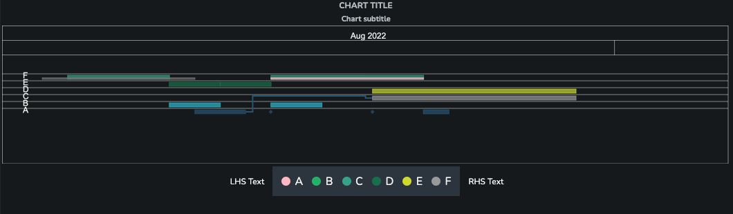
The Legend component lets you display series in an SDD as a colored legend as a separate component.
Data
SDD Table
The source of the data displayed in the Legend component. The data should be provided in SDD format.
Series Key
Name of the column that distinguishes the series in the data.
Properties
LHS Text
Optional text shown on the left-hand side of the Legend.
RHS Text
Optional text shown on the right-hand side of the Legend.
Item Alignment
Determines how the legend items should be aligned. The items that don't fit in the container will be shown when scrolling the page.
The options are:
Auto(default) or a fixed number of columns or rowsFixed Columnsset a fixed number of columns to show the data inFixed Rowsset a fixed number of rows to show the data in
Fixed Columns
The number of columns to use for displaying the legend items.
This property is only visible if the item alignment is set to Fixed Columns.
Fixed Rows
The number of rows to use for displaying the legend items.
This property is only visible if the item alignment is set to Fixed Rows.
Horizontal Alignment
Horizontal alignment of the legend in the container.
This won't apply if the legend is placed in a Flex Box component as it is determined by the properties of the flex box.
Center(default)LeftRight
Font Size
Font size of the text items.
LargeMedium(default)Small
Padding
Padding to use around the control. It is set to 0px by default. The value should be set in valid CSS values, for example 5px, 1em, 0.5rem.
Color Overrides
Series Colors
The source of the data for the color overrides of the series. The data should be provided in SDD format.
Series Key
Name of the column that distinguishes the series in the data.
Color Key
Name of the column that distinguishes the color in the data. The value of the color column should be a valid CSS color, for example red, #FF0000, rgb(255,0,0), rgba(255,0,0, 0.5).