Interactive SVG
Useful Information About CSS Selectors
During Configuration of Data Source, Tooltips etc. you will need to provide data, that specifies, in which element changes will be implemented or tooltips will be added etc. This data are CSS Selectors.
Parent Element And Children Elements
IMPORTANT: Definition below is not an exactly same as CSS docs definition, but it is adjusted to fit in the best way behaviour of our components.
If there is an element A and inside it there are elements: B, C and inside C is element D.
A is parent element for B, C and D. C is a parent element for D.
D is a child element for C and A. B, C and D are children elements for A.
Classes and Ids
Element's class is a value assigned to class attribute in HTML tag
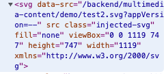
Element's id is a value assigned to id attribute in HTML tag

Properties: Parent Id, Parent Class, Children Id, Children Class
In these properties, you should provide just name of the class or id, without any prefixes or suffixes
Property: CSS Selector
This property is much different, than previous ones, you should provide here valid CSS Selector according to its docs. If you will provide anything here, previous properties will be ignored.
General rules of CSS Selectors:
Prefix for id is
#and for class is.. Examples:id="idName"-> CSS Selector =#idNameclass="className"-> CSS Selector =.classNameYou can use tag names inside selectors too.
If you want to select sth, what is inside sth else you need to provide classes/ids/tag names etc. in specific order. In general, if you want to select element B, which is inside alement A, you should provide A first and than B.
Example: CSS Selector:#stockyard_9 tspanmeans, that you are looking for HTML tagtspan, which is inside element with idstockyard_9. On the image below you can see CSS structure you can select with this selector.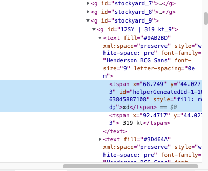
Useful links
CSS Selectors
CSS Selectors - less reliable source
Data
Layers
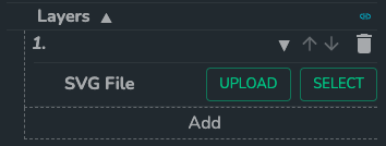
List of SVG files to render.
Layers might be loaded from SVG files stored directly on user's computer, or from files already uploaded to dais ('Files' in App Administration).
Data Source
type: SDD Data
List of data used to modify SVG content (colors, text) and to control selecting functionality.
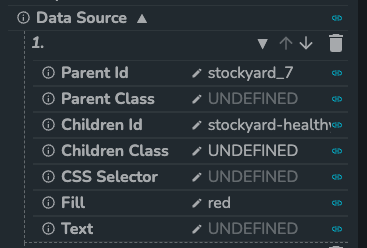
Parent Id
(optional)
type: string
Id of the parent of the element, you want to select.
Parent Class
(optional)
type: string
Class of the parent of the element, you want to select.
Children Id
(optional)
type: string
Id of target svg element.
Children Class
(optional)
type: string
Class of target svg element.
CSS Selector
(optional)
type: string
CSS selector pointing to target svg element. i.e. '#id .class'.
Fill
(optional)
type: string
Html color to overwrite in selected svg element.
Text
(optional)
type: string
Text to overwrite in selected svg element.
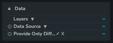
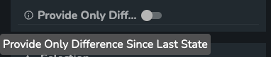
Provide Only Difference Since Last State
type: boolean
Setting to specify if you want to provide to "Data Source" complete data about state or just difference since last provided data set.
Selection
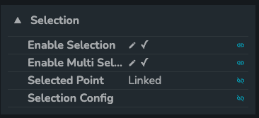
Enable Selection
type: boolean
General setting to enable selecting feature in component.

Enable Multi Selection
type: boolean
Setting, that allows to have many points selected at the same time.

Selected Point
type: string - it needs to be linked to the store
Setting to provide a link to location in store, in which data about selected elements is stored.

Selection Config
type: SDD Data
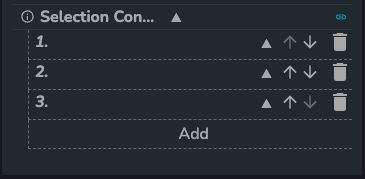
Settings, that provides information about selection feature config: which elements should be selectable and what are their ids.
Parent Id
(optional)
type: string
Id of the parent of the element, you want to select.
Parent Class
(optional)
type: string
Class of the parent of the element, you want to select.
Children Id
(optional)
type: string
Id of target svg element.
Children Class
(optional)
type: string
Class of target svg element.
CSS Selector
(optional)
type: string
CSS selector pointing to target svg element. i.e. '#id .class'.
ID
type: string
ID that is used during selecting.
Tooltips
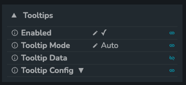
Tooltips might work in two different modes: Manual and Auto, in each mode tooltips options are different, but don't worry, both of them are described below.
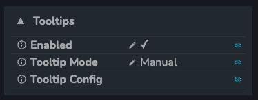
Enabled
type: boolean
General setting to enable tooltips feature in component.

Tooltip Mode
type: string
Settings, which switches between Manual mode and Auto mode.
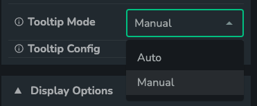
Tooltip Mode: Manual
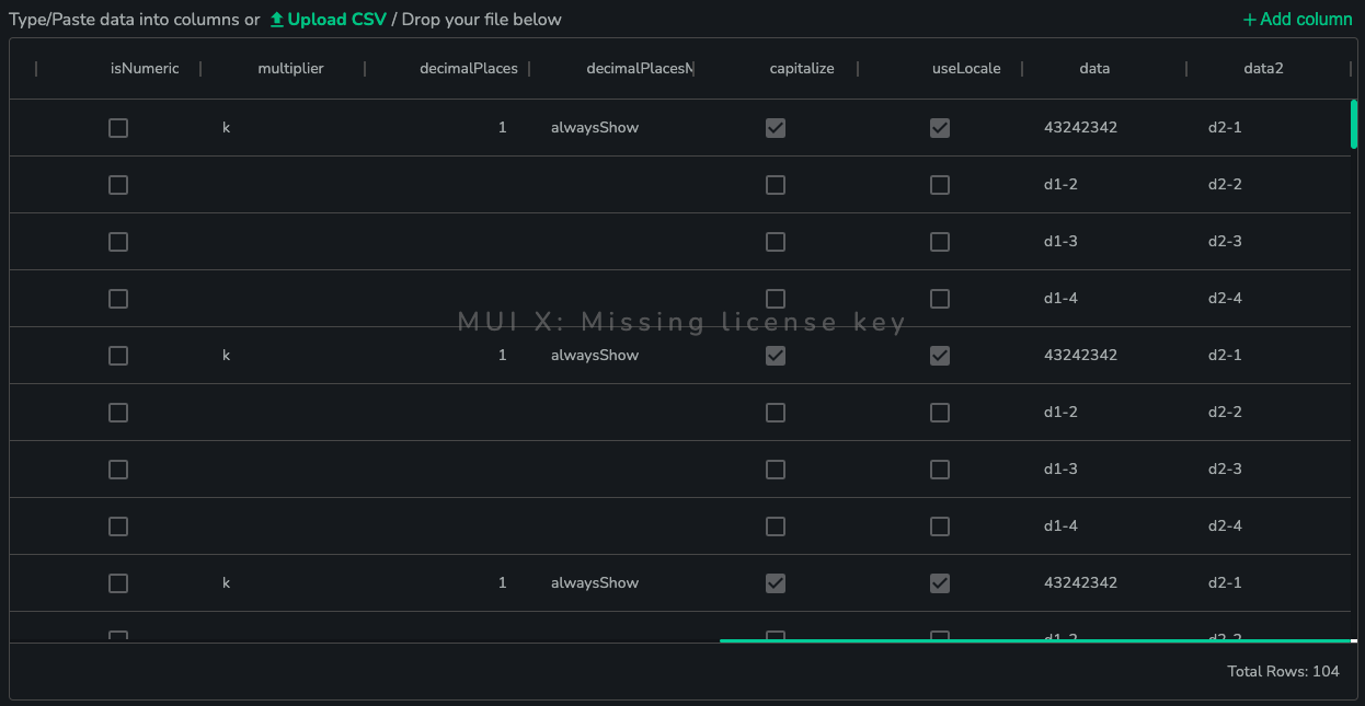
In this mode user provides data to Tooltip Config, which consists out of rows with selector, tooltip value and tooltip formatting info. Every tooltip listed there is displayed when user is hovering over specific element.
Tooltip Config
type: SDD Data - it needs to be linked to the store
List of data used to control tooltips feature.
It is recommended to provide data to this feature as a link to datastore.

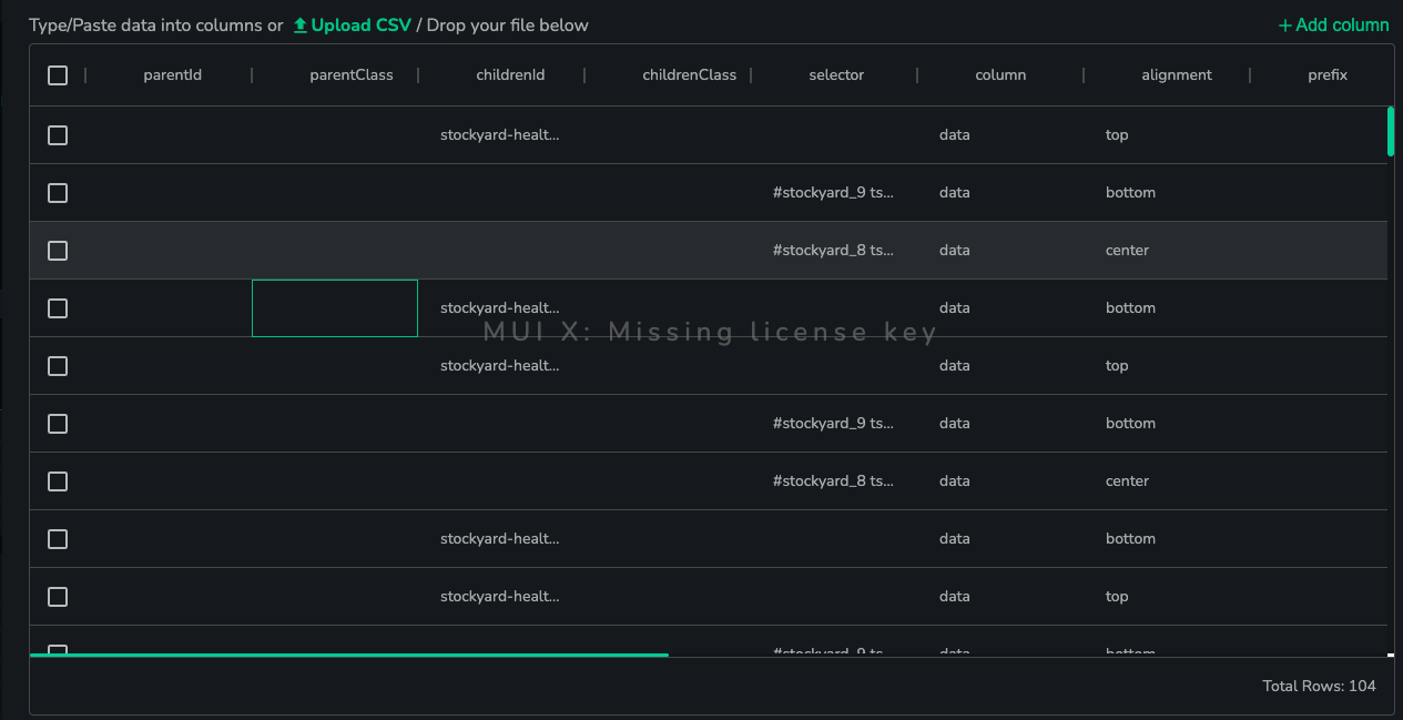
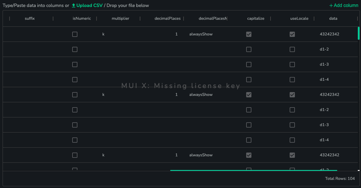
parentId
(optional)
type: string
Id of the parent of the element, you want to select.
parentClass
(optional)
type:string
Class of the parent of the element, you want to select.
childrenId
(optional)
type: string
Id of target svg element.
childrenClass
(optional)
type: string
Class of target svg element.
selector
(optional)
type: string
CSS selector pointing to target svg element. i.e. '#id .class'.
column
type: string
Name of column, in which data to display in tooltip is stored.
alignment
(optional)
type: string
Alignment of the tooltip. Valid options are: top, center and bottom
prefix
(optional)
type: string
Text to display at the beginning of the tooltip.
suffix
(optional)
type: string
Text to display at the end of the tooltip.
isNumeric
(optional)
type: boolean
Setting to determine if tooltip value is numeric.
multiplier
(optional)
type: string
Specifies rounding of numeric value - up to thousands, millions etc.
decimalPlaces
(optional)
type: number
The number of decimals displayed in a number.
decimalPlacesMode
(optional)
type: string
Specifies if last decimals with "0" character should be shown.
capitalize
(optional)
type: boolean
Specifies if unit sign should be capitalized, like M - millions etc.
useLocale
(optional)
type: boolean
Specifies if value should be formatted according to local rules (numbers are sometimes written differently in different countries).
other
Other columns with data, which is used to be displayed in a tooltip. The currently used column is specified in column prop. User can create only one column, if there is no need for more.
Tooltip Mode: Auto
In this mode everything works more similar to other charts in DAIS. User provides SDD data to Tooltip Data, this data consist of selector column and one/many column(s) with values. You can think about each row of Tooltip Data as a point in chart, because it might have many values assigned to it. Which of them should be displayed in tooltip and how they should be formatted is controlled by Tooltip Config property.
Tooltip Data
type: SDD Data - it needs to be linked to the store
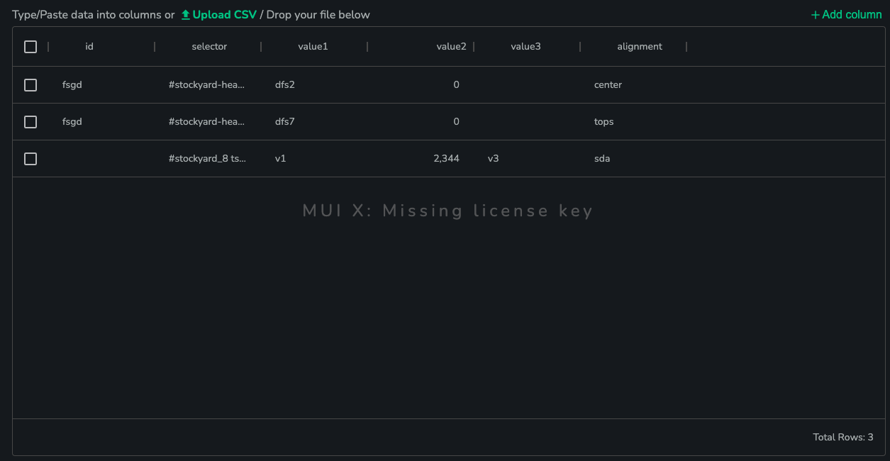
This setting takes SDD Data with id, selector, alignment fields and other fields with any name, which are being used to keep data. All elements selected by selector will display tooltip during hovering over it, if at least one of "value field" names will be specified in Tooltips Config and value will be assigned to them in specific row.
For example:
There is a Tooltip Data with 3 rows, selectors in these rows are #elem1, #elem2 and #elem3, fields with values assigned to them are value1 to #elem1 and elem2 and value2 to #elem2 and #elem3. If the user specified value1 in Tooltips Config as name of field, whose value should be displayed in tooltip, #elem1 and #elem2 would display a tooltip with value assigned to value1 in their rows and #elem3 wouldn't display anything. If user specified value2, #elem2 and #elem3 would display value and #elem1 wouldn't display anything etc. If user specified both value1 and value2, #elem1 and #elem3 would display single value in tooltip and #elem2 would display double value.
It is recommended to provide data to this feature as a link to datastore.

selector
type: string
CSS selector pointing to target svg element. i.e. '#id .class'.
alignment
(optional)
type: string
Alignment of the tooltip. Valid options are: top, center and bottom
other
Other columns with data, which are used to be displayed in a tooltip.
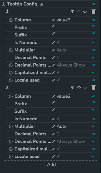
Tooltip Config
type: SDD Data
List of data used to control which data specified in Tooltips Data should be displayed.
column
type: string
Name of field in Tooltip Data, whose value should be displayed in tooltip.
prefix
(optional)
type: string
Text to display at the beginning of the tooltip.
suffix
(optional)
type: string
Text to display at the end of the tooltip.
isNumeric
(optional)
type: boolean
Setting to determine if tooltip value is numeric.
multiplier
(optional)
type: string
Specifies rounding of numeric value - up to thousands, millions etc.
decimalPlaces
(optional)
type: number
The number of decimals displayed in a number.
decimalPlacesMode
(optional)
type: string
Specifies if last decimals with "0" character should be shown.
capitalize
(optional)
type: boolean
Specifies if unit sign should be capitalized, like M - millions etc.
useLocale
(optional)
type: boolean
Specifies if value should be formatted according to local rules (numbers are sometimes written differently in different countries).
Display Options
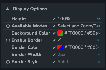
Height
(optional)
type: string
Height of the SVG component.

Available Modes
type: string
Specifies, which modes should be displayed in toolbar

Background Color
type: string
Specifies color of the background, by default it's transparent.

Enable Border
type: boolean
Setting to show/hide borders.

Border Color
type: string
Color of the border.

Border Width
type: string
Width of the border.

Border Style
type: string
Style of the border.

Properties

Min Height
(optional)
type: string
Minimum height of the SVG Component.
